| Home | FlexColorScheme | Issues | Flexfold |
| Articles | FlexColorPicker | Grid |
Constrained Centered Layout and Theming Flutter
(Oct 26, 2021)
In this article, I discuss challenges with the web center constrained layout in Flutter. I provide an introduction and an example of how-to theme Flutter applications.
Why Another Theming Example?
The “right”, or at least easy way to effectively theme a Flutter application is a bit confusing and frustration point for many new, and even seasoned Flutter developers. I recently came across this issue report and question. It inspired me to rework this Tweet thread I did about it earlier, to a Gist comment doc, just to answer the question. And now also to this easier to read and better formatted article, that also elaborates further on several points.
Used example
The example in this article can be run and tested in DartPad here, and its source code is available in a GIST here.
The Challenge: Constrained Center Layout
In this Tweet FlutterDev course producer and Flutter connoisseur Andrea Bizzotto shows us how to make a typical web like layout in Flutter.
A layout that is centered and width constrained. This keeps a reasonable max column width on the content, also on very wide screens. This makes the content easier to read, since it never expands to fill the max width of typically very wide desktop screens.
A solution, where wrapping child content like this, is presented by Andrea:

Shown Web style constrained center layout.
This works well and produces the desired result in the example. But what happens if we use this approach with scrolling content?
What is wrong with the above solution?
Let us test how the setup presented by Andrea works with scrolling content. To do so, we keep Andrea’s nice login card and add a bunch of other things to it, and put it all in a scrolling view. When we do so, we get this:
Scrollbars next to centered content!
As shown, we got scrollbars next to the body content. That is not so nice, they don’t belong there, they should be next to the end side of the screen.
How do we fix this?
In this example we start with the same setup, but use a Center, with ConstrainedBox and Padding, that gets their configuration via properties that have defaults. We loose the extra Card. We make it more generic and leave it to parent widget to decide if it wants to be in a Card or not.
Here is our new starting point. It also produces the same result, concerning the not desired content-centered scrollbars.
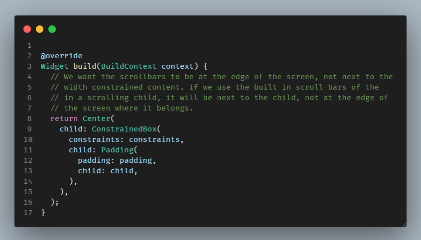
Alternative starting point.
This is actually very simple to fix. We disable the scrollbars for the child and put our own Scrollbar outside of theCenter widget.

Moving scrollbars to the edge.
We also assigned a ScrollController to Scrollbar. This controller may, when needed, be passed in from the parent, where it is created and connected to the actual scrolling view.
  /// Optional scroll controller for the constrained page body.
  ///
  /// If you use a scrolling view as child to the page body, that needs a
  /// scroll controller, we need to use the same controller here too.
  ///
  /// If null, a default controller is used.
  final ScrollController? controller;
The Result
This seems to work OK, right? The scrollbars are now on the edge, so that is good and as it should be. Done? Not quite.
 Scrollbars now next to view end side, but…
There is an issue with this solution. If you touch or mouse-wheel scroll from the expanding margins that do not contain any content, the content does not scroll.
Web pages, using this layout, do not behave this way. They do scroll from the empty margins too. It is poor UX that it does not do so here as well.
Do you have a simple fix for this? Have you solved this layout problem in Flutter? Do you already have the perfect solution for it? If you do, please let me know.
I have not seen a good simple solution for it yet. I admit I only looked at the issue briefly once. There might be a simple solution, or it might actually need a lower level custom layout to be solvable effectively. I do plan to look into eventually when I really must have a solution for it. However, I’m putting on hold looking into further for now.
Next, let’s dissect this example app further. It also contains many other fascinating goodies.
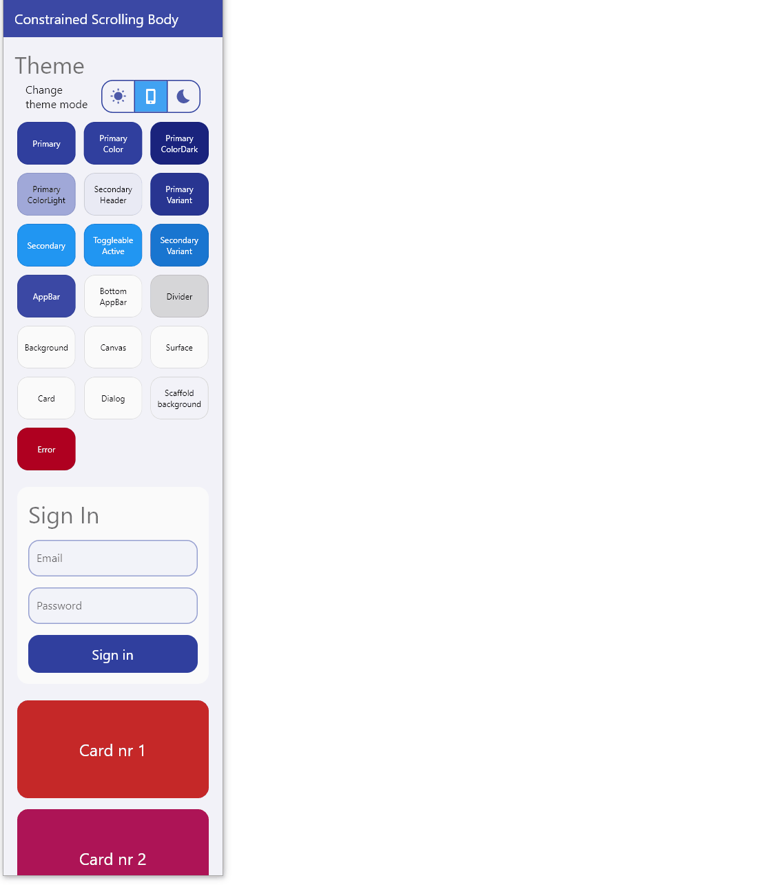
The HomePage in this Demo
The HomePage has these interesting features:
- The constrained body via
CenterConstrainedBody - Having a
CustomScrollView, withSliverLists,SliverGrid(6) andSliverToBoxAdapters. - We can toggle theme mode with the
ThemeModeSwitch - See theme colors via
ShowThemeColors - And yes, Andrea’s mock sign-in card is there too.

Parts of the example HomePage.
The slivers have been written about in many other blog posts in great detail. We will skip that part here, but let’s dig deeper into the theme.
Demo App Theme
Let’s back up a bit. The theme looks a bit fancy. It is not totally ordinary, what is going here with the theme?
If you look at the demo code, you can see that we have, for example, not put the border rounding on the widgets, they are a part of the global theme for the demo application. If we want to make everything more rounded, like in MaterialYou (Material 3), then obviously this is the way to do it.
The dark mode and light mode also have a hint of primary color mixed into the background color. This is called alpha blend of a color. In this case, of the primary color, into background and other surface colors.
This color design principle appears to be used quite extensively in the new MaterialYou based designs as well. We can see it used a lot in Android 12, creating very neat and personal touches to the visuals.

Light and dark theme of the example app.
Changing Theme Mode
The theme toggle is a simple StatelessWidget using Flutter ToggleButtons. You can make pretty cool stuff with it, and it is easy to use. As an example, here is how the theme toggle is done:
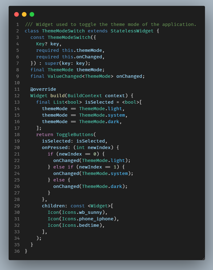
ToggleButtons based theme mode switch.
The MaterialApp setup is just a very basic example, a light and a dark theme with a call back to toggle the mode. Yes, you can use the system mode too and let the theme change with the host’s light and dark mode changes.

Setup of the MaterialApp.
The app uses very standard Flutter theming, no magic. I wrapped the light and dark themes in a simple custom AppTheme class.
The theming has some perhaps not entirely basic things going on. It is still using just normal Flutter Material colors, but with some alpha-blend flair, and slight transparency on the AppBar and BottomNavigationBar, so we can see the content as it scrolls behind them.

The light theme definition.
The important take-away about the used theme here, is that we are creating the theme using the ThemeData.from factory, that takes a ColorScheme and not using the ThemeData factory constructor. This way we get a theme that follows the Material-2 design guide.
Using ThemeData.from a ColorScheme.dark as starting point is even more important for the fidelity of the dark theme, since it results in dark surface colors and elevation overlay on surfaces, that follow the Material design guide. The theme factory ThemeData does not do this.
For more information on theming please se the Material design guide here concerning light theme, and here for dark theme design.

The dark theme definition.
This way of creating Flutter themes is not really so well covered in the official documentation yet. You have to read about it in source code comments and/or API docs.
Adding Widget Sub-themes
We also add some needed theme helper functions to the same AppTheme class with more purposefully designed (opinionated) sub-themes that we want to use.
In these sub-theme examples we do some adjustments to the CardTheme and InputDecorationTheme:

Card and InputDecorator
As well as to the ElevatedButtonThemeData and ToggleButtonsThemeData like this:
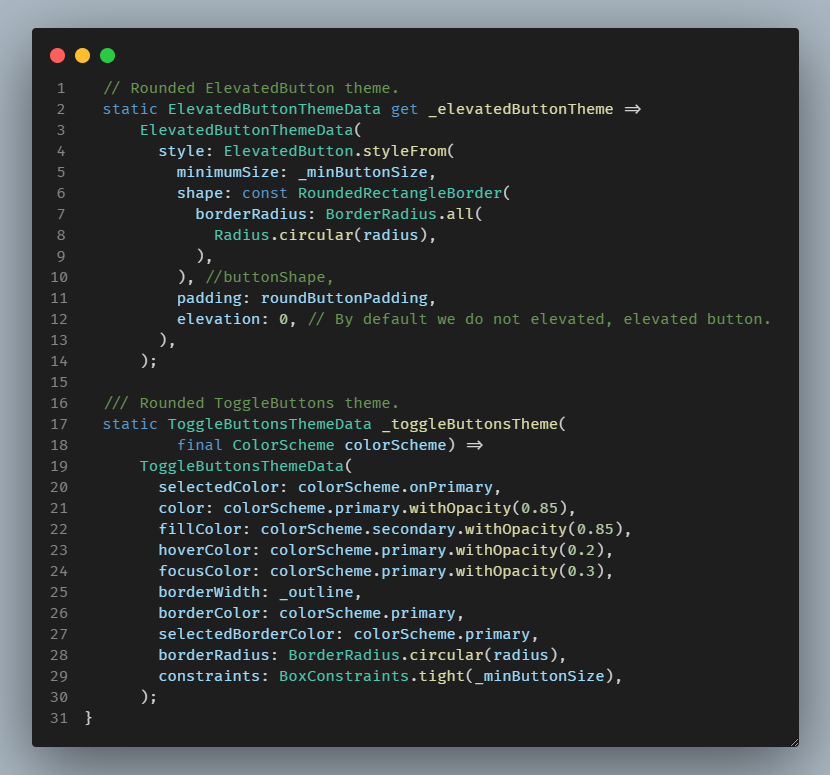
ElevatedButton and ToggleButtons
There is also a custom app bar and bottom navigation bar theme data definition.

BottomNavigationBar
These just demonstrate a few simple sub-theme examples, including among other things, the more rounded shapes.
All in all, pretty straight forward, and the end result is pretty cool and nice looking.
 Example running in DartPad
As mentioned at the beginning of the article, you can try the example in a live DartPad demo here.
State of Flutter Theming
You might have noticed that some of Flutter’s sub-theme data classes do not end with Data in their class name. The design goal is that they all should do so, but due to legacy naming inconsistencies, some do not.
There are also many legacy colors that widgets still depend on in the ThemeData class directly. There is a migration plan on how to clean up ThemeData and move towards having the colors that widgets depend on for their
default color design, to be based on ColorScheme class, via property colorScheme in ThemeData.
To some extent, this migration has progressed, but there is still a lot of work pending. Some of it is hard to clean up without breaking past Flutter code that a lot of applications use. You can read more about this design change and migration in this Flutter design document.
At the time of writing, we do not yet know what kind of adjustment Material 3 will bring to the theming in Flutter. It could be very minimal changes, or we might even see a new cleaner theming solution.
Finally
Do you have a nice solution that also scrolls from the expanding side margins? Please do let me know!
Created 26.10.2021