| Home | FlexColorScheme | Issues | Flexfold |
| Articles | FlexColorPicker | Grid |
Flutter Theming Guide
(Published May 1, 2022, Updated May 4, 2022)
The Flutter ThemeData object defines the look of your application, and to a degree how it behaves. The ColorScheme class is a data class that holds 27 Color properties. Flutter’s built-in components use these colors in predefined ways. The property name for the used ColorScheme in ThemeData is colorScheme.
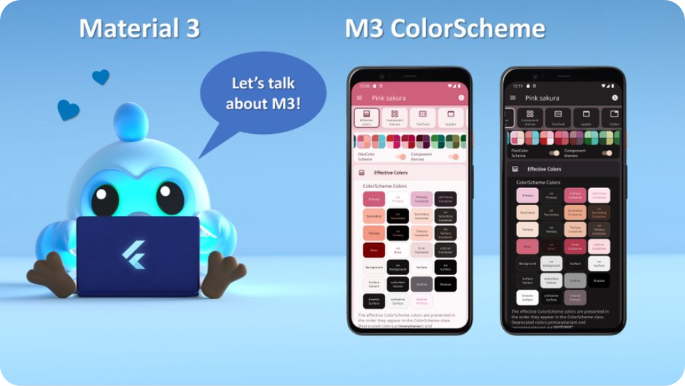
The color scheme used to be a lot simpler before Flutter 2.10, the introduction of Material 3 makes it more complex. There are new features that can help with the color design. For more information about the color system, see the Material 3 guide. This tweet with 15 slides, offers an intro to the wondrous world of Material 3 ColorScheme.
Why Theme an App?
You should strive to make the built-in widgets in Flutter look as close as you can to the look and design you want them to have in your application. You should do this by defining an application theme that gets you as close as possible. By doing so, you use Flutter and its theming capabilities to work for you, and not against you. When you do this, most of your application’s design will fall into place almost automagically.
You can customize a surprising number of details with ThemeData and all its component themes. There are certainly limitations, but always check first what you can do by theming the app and the built-in components it uses, to match your style requirements as close as possible.
Custom Widgets
When it comes to custom Widgets you make, you should, when possible, base their default styles on properties in the theme as well. Consider what color, font and other styles it could use as fitting default built-in behavior. Are there properties in ThemeData and its component themes that could be applicable to your custom widget as defaults? Also provide direct members to configure your custom widget for those one-off needs when it needs to be different from what you set via the ThemeData properties it uses as its defaults.
Use the same principle that Flutter’s built-in widgets use for their theming and default style behavior. Basically, they do a fall-through from widget property, to component theme and maybe even ThemeData and its ColorScheme, and lastly, maybe even some default built-in behavior.
If you do this, then you are on your way to create nice reusable custom widgets that automatically also follow your application’s theme as you change it.
As an example, say you have a fancy complex composed custom widget, that contains an icon, among other things. In this design you decided that this particular icon should have a default color that matches the background color of a FloatingActionButton, but in some case you may want a custom one-off color. Just do what built-in widgets do, give it a nullable Color? property, e.g. iconColor and let it fall through the same default color behavior that the FAB has, like this:
  final ThemeData theme = Theme.of(context);
  final Color effectiveIconColor = iconColor ??
    theme.floatingActionButtonTheme.backgroundColor ??
      theme.colorScheme.secondary;
Now you have a color you can use on the icon, that matches that of a default un-themed FAB, using the ThemeData.colorScheme.secondary color as its default value, but if there was a FAB theme defined, it gets the background color from it. Additionally, you can give it a different custom color, for those one-off needs.
Obviously as you change your application’s ThemeData, the FAB and your custom widget, with its matching icon color, will now follow whatever style that is. If you do the change interactively in your app, its default color also lerp animates, since it depends on a theme color. Don’t hard code color and styles for your custom widgets. Don’t even default them to colors, styles and properties that are not derived from the application’s theme. At least not if you want them to change with animation as you modify the theme of your application.
If your application supports different themes that the user can switch between interactively, including dark mode, then it is important that you use theme and theme mode aware properties in your custom widgets. If you do so, all your custom widgets will adjust accordingly when you change the theme, and their change from one theme mode to another will even animate correctly.
More Colors?
With Flutter 2.10 and later we have the new Material 3 based ColorScheme, that contains more theme colors than before. Consider first how you can use these colors in your application and design. Also look into if you can compute some additional color shades from the colors in the ColorScheme, in case none of them is the right shade.
There are many ways to do this with different results. here is a simple way, using white and black colors as overlays with an alpha blend:
// Using alpha blends is a simple way to make a lighter shade of an existing
// color. Use the source color as background, and overlay it with white and
// vary its alpha to produce a lighter shade of the source color.
final Color lighterPrimary = Color.alphaBlend(
    Colors.white.withAlpha(0x66), Theme.of(context).colorScheme.primary);

// To make a darker shade, do the same but use a black overlay and vary its
// alpha to produce a darker shade of the source color.
final Color darkerPrimary = Color.alphaBlend(
    Colors.black.withAlpha(0x66), Theme.of(context).colorScheme.primary);
Sometimes you might indeed need a lot of different colors not found in ThemeData, its Colorscheme or any of its sub-themes. This is common e.g. for legends on charts or maps. For those cases, using a collection of const colors that define them and using them globally is often an acceptable and pragmatic solution.
These are typically not application design colors. They are more like color attributes. They represent certain properties in the real world, or at least a studied data set of it. Such colors, depend more on how you want the visualized data to be presented, and not on how the application design should look. They thus lend themselves well to being outside the core application design theming.
Of course, if you only need few such colors and are not using all the colors in the ColorScheme for your application’s design, then nothing really prevents you from tucking in 3 to 4 colors in the ColorScheme for this purpose. If you do so, you may need to set colors of some component themes to some other colorScheme based color values, if they used those colors. Currently, this is not big challenge as most components typically only use ColorScheme.primary or secondary color by default.
You can of course in component themes use defined const color values that are not from your ThemeData.colorScheme color set. If you change these colors in our component theme interactively, their transition will also be nicely animated when you change the theme. They are still themed color values but not just defined via the theme ColorScheme. The Flutter’s Material components are designed to use a coherent shared ColorScheme based design, so if you do this you should verify that your alternative design looks pleasing too.
FlexColorScheme on purpose only allows you to select colors from the theme’s ColorScheme based colors when you customize what colors its opinionated component themes should use on themed components. If you make completely custom component themes, you can of course use whatever colors you prefer in them.
Default Scheme Colors?
What colors and TextTheme styles are used by Flutter’s widget by default?
This is a good question. Currently, they follow the Material 2 design guide defaults, and will eventually move to follow the Material 3 design guide defaults.
When it comes to default color usage in Material 3, the design guide does not really yet cover all the details. When widgets start adopting the Material 3 style when you set ThemeData.useMaterial3 to true, we will be able to both see and check in the source what the new defaults really are.
Saying that components use M2 and M3 defaults as their colors, is not really an easy-to-use answer in my opinion either. As a future update for this guide, I plan to add a cross-reference table that lists color defaults for different widgets. As defined in Material 2, Material 3, FlexColorScheme with no component themes and with them enabled. Hunting for the color defaults in the Flutter SDK source code is possible, but it is a bit tedious. A table listing them “as implemented” in the source code, would be very helpful.
Extended Themes?
You can make custom inherited themes for your custom widgets as well. You can even extend Flutter’s theme. We won’t be going into that in this guide, not in this version at least. In later revisions to this guide, I might add some examples of these possibilities too.
However, if you are interested in it right now, then this article by Didier Boelens is excellent and one of my favorite ones on the topic. It is based on an older not null safe version of Dart and Flutter, but its principles are still the same.
Custom TextThemes?
Another thing I frequently look up in Flutter SDK code is the TextTheme and which text style is used where, by what widget. The main place to find this out is in the Flutter source code. I might consider adding a cross-reference table for this as well.
The article above also contains an older Excel cross-reference table of what TextTheme TextStyle is used as default style by each Flutter Widget. Since the article is a bit aged, some of them might have changed, but I don’t think so. There are, however, some newer widgets that are not covered, simply because they did not exist when the article was written. For the same reason, it also does not contain a cross-reference of the new M3 style with the past M2 styles.
You can find an image comparing the new Material 3 with the Material 2 text styles in this Flutter issue #89853. For easy reference, here is the same image borrowed from the above source:

Comparing Material 3 (M3) and Material 2 (M2) Text Styles
Defining custom TextThemes for Flutter can be a bit challenging if you do not know exactly which component uses what style. The large heading styles are generally not used in Flutter SDK. They can mostly be quite freely modified without impacting component defaults in unforeseen ways. As can be seen above, this is exactly what the Material 3 styles did. This was a good move too, since pretty much all the M2 heading text styles were too big to be very useful by default.
The smaller TextStyles in the TextTheme are used in the SDK all over the place, and it is not well documented anywhere where they are used, other than in the above article. If you need to know, you can use it, or do a search of a style in the SDK source code to find out where they are used.
If you modify the text styles, and don’t know exactly how they are used where, you may get unforeseen results on some widgets due to the changes you made. Adjusting them a few point sizes up or down usually works fine. However, some widgets, e.g. ListTile uses the color and its opacity from one TextStyle, it kind of borrows it and applies it to another TextStyle is uses from the TextTheme. This is done to create less impactful default subtitle text style for the ListTile, using an opacity value it does not have in M2 on the TextStyle it uses for size and letter spacing on its subtitle. If you were to change the source TextStyle’s color’s opacity it uses for this, your ListTiles would no longer look as intended or expected.
This was just one example, there are many other details like this built into default text style behavior for Flutter SDK UI components.
What can you change?
Prefer to only make custom font family adjustments on the global app TextTheme. On the smaller and mid sized TextStyles in TextTheme, only make minor point size adjustments and letter spacing tweaks. Don’t do anything too radical with it, then your app’s components may still look fine.
For bigger changes, add your custom TextStyle to the component theme level instead. For example, if you want an AppBar with a custom TextStyle. You might think you have to dig into the source to see what TextStyle(s) from the global TextTheme it uses by default. Then modify the TextStyle(s) it uses for your global app TextTheme, to give your AppBar the desired themed TextStyle. Don’t do this, if you do, multiple other components will be impacted.
The AppBarTheme has a titleTextStyle and toolbarTextStyle, define these TextStyles instead to follow your custom design need for the AppBar component, and repeat with other components that requires custom TextStyles in your design. This of course only works if the component theme has and uses a component level TextStyles. At least check for this before you go berserk on the global TextTheme.
FlexColorScheme does not include any component level TextTheme support yet in its opinionated component themes. It only includes textTheme and fontFamily as pass-on to ThemeData for the global app TextThemes. It also has a custom “m3like” TextTheme that it for now uses when you opt-in on using M3 text theme. It uses this custom text theme because the real M3 Typography (sizes and geometry) have not yet landed in Flutter 2.10. This text theme will be replaced by using the actual M3 TextTheme and its geometry once it lands in the stable channel. This is the PR 97829 that needs to land to be able to make that change.
FlexColorScheme could perhaps in some later version also add some TextStyle configuration options to some of its opinionated components themes. At least where it is frequently used. If so, where would you like to see it? Drop your ideas and thoughts on it in the repo discussions.
New Theme Extensions
A new and exiting feature that is arriving in next stable version of Flutter, after 2.10, is Theme Extensions. This new feature is nicely presented in this FlutterDev YouTube video, released May 3, 2022:
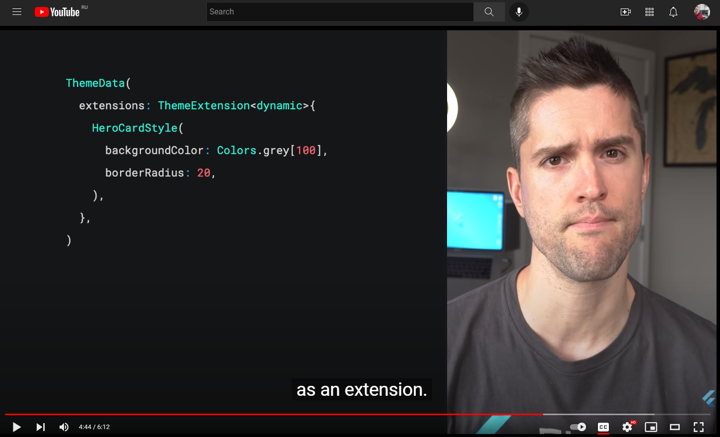
Flutter New Theme Extensions
This feature finally solves the limitation of not being able to easily hook into the Flutter theming engine and extend it with properties your custom widgets need. A very simple use case is just adding more colors to the theme, that your application needs. But of course all other properties your custom widgets needs as well, like those TextStyle as well.
With theme extensions there is no reason why your custom widgets should not have its own theme if it is complex enough to warrant it. Going forward we should expect that well written user interface packages come with their own theme extension.
Based on my early assessment of the Theme extensions, it completely changes what you can do with theming in Flutter, you can finally build that design system you always wanted to make to speed up your development, and ensure easy to reuse design consistency.
Defining ThemeData
The Flutter ThemeData object is a very large theme property data, and theme behavior controlling class. It can change the look and feel of Flutter applications completely. It is not really that difficult to use, but it has many quirks and oddities, especially when it comes to used colors. This is mostly due to past legacy and things that were not considered early on. Some parts were done differently first, later things changed, but those earlier ways are still supported in order to not break past behavior.
With many new ways to define and setup colors added later, it can all become a bit confusing. This is further amplified since the official docs and its theming guides may still use the old methods, that do not produce as nicely colored and color consistent themes.
When you make themed Flutter applications you should base the colors of your application on a light theme mode suitable ColorScheme, and a dark theme mode suitable ColorScheme. Then create your light and dark ThemeData using these color schemes, by assigning the ColorScheme for each mode to the colorScheme
property in ThemeData.
In your MaterialApp you then assign the ThemeData for your light, and dark theme to the theme and darkTheme properties respectively in the MaterialApp.
void main() => runApp(const DemoApp());
class DemoApp extends StatelessWidget {
const DemoApp({Key? key}) : super(key: key);
@override
Widget build(BuildContext context) {
return MaterialApp(
debugShowCheckedModeBanner: false,
title: 'Custom ThemeData',
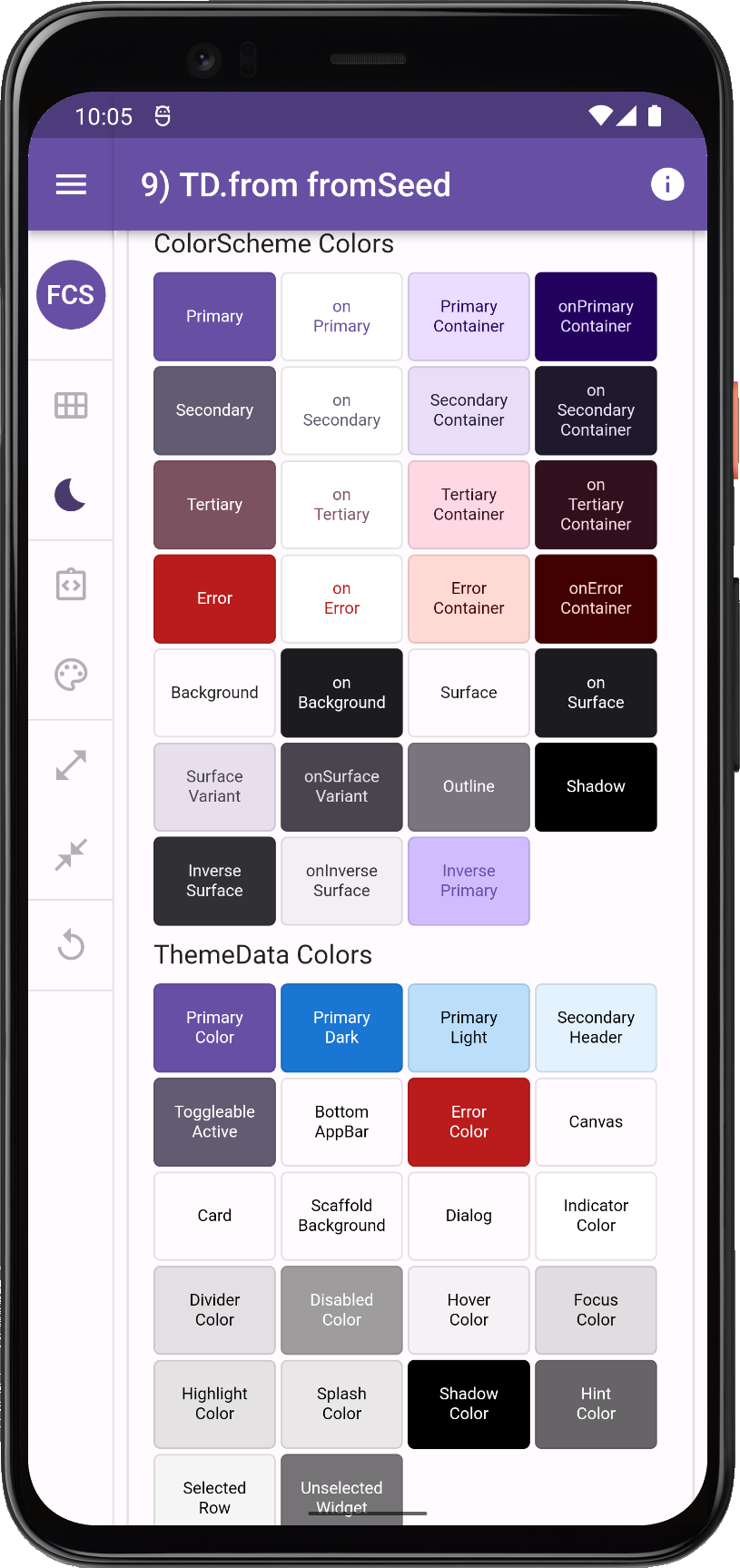
theme: ThemeData.from(colorScheme: mySchemeLight),
darkTheme: ThemeData.from(colorScheme: mySchemeLight),
themeMode: ThemeMode.system,
home: HomePage(),
);
}
}
In theory this gives you an application that uses the defined color schemes on all the Flutter SDK built-in Material UI widgets. Well it should, and it almost does, especially if you used Flutter’s ThemeData.from a ColorScheme factory, used above. However, even it has a few gaps. The used color scheme is not consistently applied on all built-in Flutter SDK Material UI Widgets. To get it completely covered, you also have to assign a few colors from your ColorScheme to a few color properties that still only exist as direct color properties in ThemeData.
This is all further complicated by the fact that under the hood many Flutter SDK UI widgets still use the original direct color properties in ThemeData. These properties are now mostly assigned color values via ThemeData.colorScheme. Exactly how and which colors depends on which ThemeData factory constructor you use, as mentioned the factory ThemeData.from does the best job.
Some older components still do not use the ThemeData.colorScheme properties for their default color values directly, they still use color property values from ThemeData, that may have gotten values assigned from ThemeData.colorScheme, this behavior varies depending on used ThemeData creation factory!
Very basic and old widgets, like for example Material and Card fall into the category of widgets that actually still use ThemeData color properties as their default color values. While some newer widgets use colors from ThemeData.colorScheme directly. Additionally, the colors in the ColorScheme held by the colorScheme property in ThemeData can actually not represent all the colors that exist in ThemeData’s color properties. Thus, some color properties never get any ColorScheme based values assigned to them. They are left to default values assigned by the ThemeData factory, unless you explicitly assign them color values that fit with your color scheme. If this is not done, it can then look odd when some widgets use the factory default colors, while the rest of your app’s widgets correctly use the ColorScheme based colors. Luckily there are not so many widgets left that this still applies to, but there are a few, for example CircleAvatar.
It can all be confusing and a bit frustrating to fight with ThemeData and its colors, and if not done correctly, it may result in themes with color schemes that are not entirely consistent or logical across all standard SDK widgets in your application.
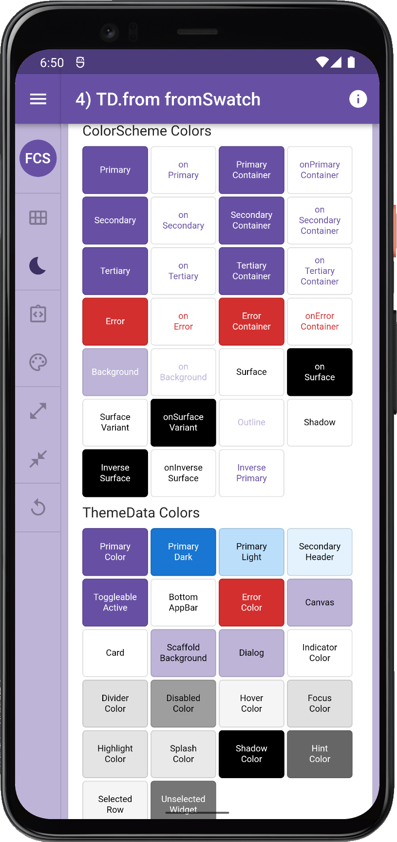
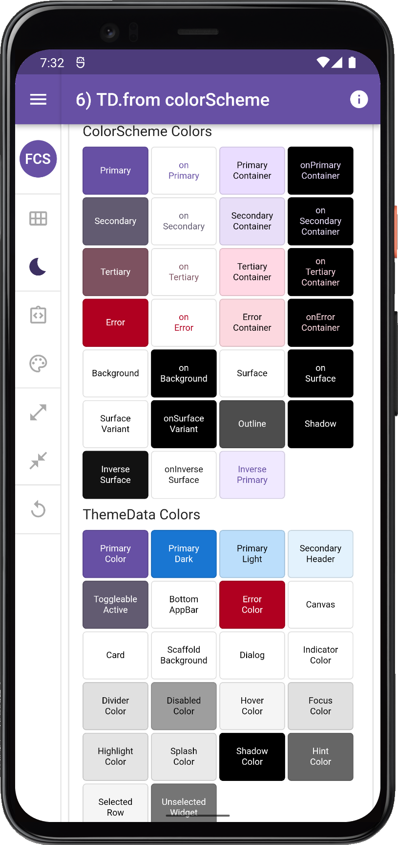
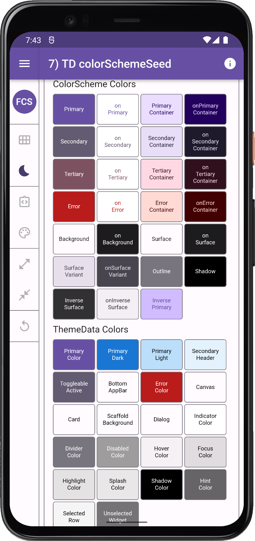
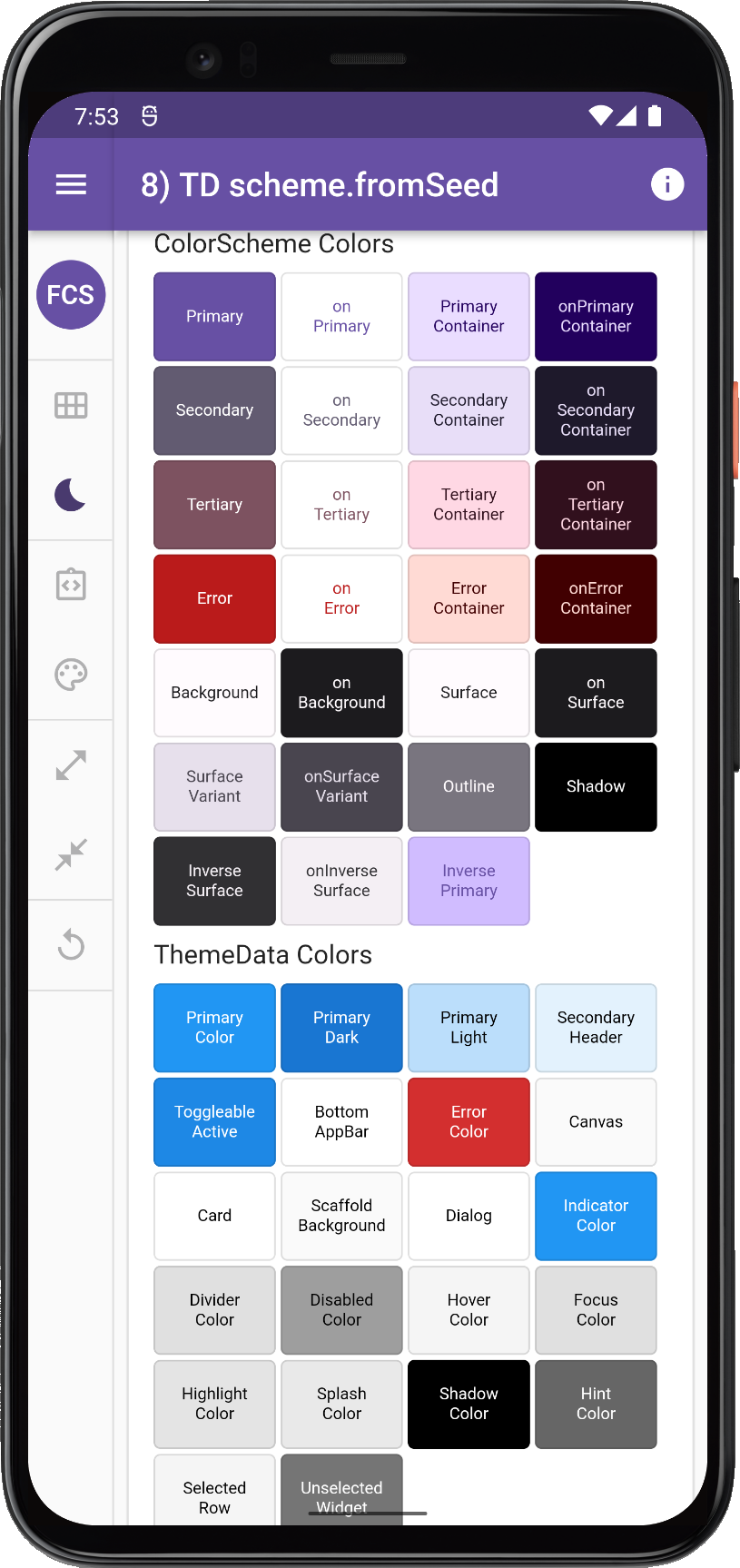
In the article Roads to ThemeData we look at all the different ways to define a ThemeData object. We will see different result like these, depending on how we create our ThemeData the results can vary a lot, even if we use same input colors.
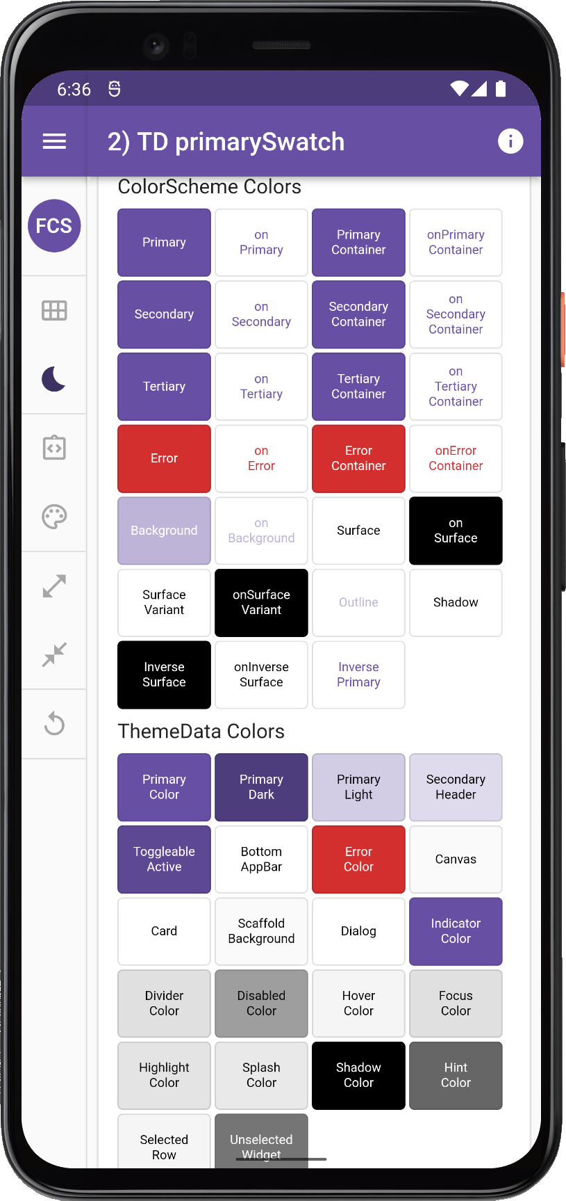 |
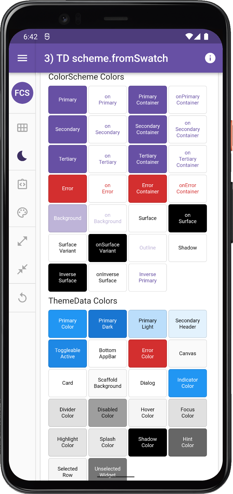 |
 |
 |
 |
 |
 |
 |
Many different ways to make ThemeData using same ColorScheme or same seed color
Deprecation Road-map
There is a Flutter development plan in progress to deprecate all of the direct color properties in the ThemeData class. Flutter SDK widgets should after that only use ColorScheme based colors that are in the ThemeData colorScheme property, as default colors for their designs.
This design document describes the plan and reasoning. There is also a color property deprecation check list in issue 91772 to mirror this plan. It has taken a while, but there is a lot of activity and progress being made on this now in the Flutter master channel, it is all also a bit mixed in with bringing full Material 3 support to Flutter.
For FlexColorScheme the progress of these actions are monitored closely. Needed changes and updates to FlexColorScheme will be implemented when relevant changes in ThemeData reach the Flutter stable channel.
FlexColorScheme already of course correctly defines complete ColorScheme for ThemeData that can also be M3 design compliant. The typical maintenance need is removing deprecated ThemeData properties and check if some new sub-theme color property needs to be modified or added, in order to replicate past FlexColorScheme theming behavior, when its corresponding color property is
removed from ThemeData.
ThemeMode
In some older apps and theming guides you might see setups where the light and dark themes are both assigned to theme using a conditional operator depending desired Brightness.
Don’t do this, it was something that was used way back, before there was a darkTheme property in the MaterialApp. Instead do assign your theme mode appropriate themes to the correct properties in the MaterialApp. This also applies to the highContrastTheme and highContrastDarkTheme theme. If your app has special designs for high contrast accessibility themes, do assign them to these properties. These properties are all there to give you the right device system settings driven behavior. So your app can follow device system theme mode and its high contrast accessibility setting.
If your app does not offer a way to toggle theme mode via the themeMode property, then keep themeMode at its default ThemeMode.system, so that the app theme automatically follows the device theme mode. If you do offer a way to override and set the app to light or dark theme independently of the the system, personally I like this. If you do this, then always also include in the settings an option to use the system mode, that follow the system setting. This should even be your first run default value for it. Now you covered all options, and users can set the theme mode as they prefer.
FlexColorScheme ThemeData
At its core FlexColorScheme.toTheme only creates a ThemeData object. It helps you make a consistent color scheme based theme, and to produce a more refined Flutter ThemeData object. Since it produces a standard ThemeData object, you can also further refine it as much as desired by using ThemeData.copyWith.
One of the fundamental things FlexColorScheme does, is that it fixes minor inconsistencies and gaps that exist with Flutter’s ThemeData.from factory, and handles the complexity of using the ThemeData factory directly. It releases you from the burden of knowing what colors in it affects which widgets how.
FlexColorScheme makes a few opinionated, but subtle theme modifications compared to the ThemeData.from themes created from a ColorScheme. By default, FlexColorScheme theming refrains from touching theme properties not related to making the colors more consistent. Some minor adjustments are however
needed. This is covered in detail in the API guide section in Core defaults.
When you opt-in on using its opinionated component themes, the story changes, then it does a lot customizations using Flutter’s component themes. This is still all done within in the ThemeData object of course. FlexColorScheme cannot make themes that you cannot repeat by defining the same ThemeData object yourself manually.
It is however very tedious and verbose to do all the things it can do manually. Personally I don’t even attempt it anymore, even if I could. It is so much quicker and simpler to use FlexColorScheme to accomplish many of the complex theme definitions it does.
Head over to FlexColorScheme.com to learn more. This article is also available as a chapter in the documentation.