| Home | FlexColorScheme | Issues | Flexfold |
| Articles | FlexColorPicker | Grid |
Theming using FlexColorScheme and Riverpod
(Published Oct 24, 2022, Updated April 23, 2022)
This article presents a Flutter application example that shows how to use FlexColorScheme together with Riverpod to dynamically change your application theme. It uses Riverpod providers to watch FlexColorScheme based light theme and darkTheme changes in a MaterialApp, and to change the used themeMode as well.
The theme settings are persisted locally as they are modified. The used local settings persistence implementation can be changed via the application’s user interface. It would be straight forward to also add persistence implementations that use cloud-based services.
The app is used primary to demonstrate FlexColorScheme and Riverpod concepts, and to provide usage suggestions. It is not intended to look extremely beautiful or be very useful as an app.
Screen recording of the ThemeDemo app with Riverpod and persisted theme changes.
Source and Web Version
The source code for the ThemeDemo application can be found in the GitHub repo github.com/rydmike/theme_demo.
You can try a live WEB version of the ThemeDemo application here www.rydmike/themedemo.
This is a 0.9.x version release, but principles will remain the same in version 1.0. The app and this article like readme, may be tuned a bit after reviews and feedback, before releasing version 1.0.
Contents
- FlexColorScheme 7 and Riverpod 2
- Features
- Used
MaterialApp
3.1 Dynamic Key-Value Database Switching 3.2 ThemainFunction 3.3 Providers inmain
3.4 ListenerKeyValueDbListenerCallback When DB is Changed 3.5 State ControllerusedKeyValueDbProviderUsed by UI to Change DB 3.6 EnhancedenumUsedKeyValueDb
3.7 UI to Change Used Key-Value DB - Persistence Design Requirements
- Key-Value Database 5.1 Abstract Key-Value DB Interface 5.2 Memory Key-Value DB Implementation 5.3 SharedPreferences and Hive Key-Value DB Implementations
- Settings
6.1 Settings Entry - Application UI
7.1 Use Material 3 Switch
7.2 Active Theme Mode
ToggleButtons
7.3 Reactive UI Widgets - Theme Providers 8.1. Application Theme
- Provider Observer 9.1 Logging with the Observer
- More about FlexColorScheme 10.1 Questions
FlexColorScheme 7 and Riverpod 2
This example is designed to work with and use the stable releases of FlexColorScheme 7 and Riverpod 2. It uses many advanced FlexColorScheme theming features, but not as many as the Themes Playground application. It does, however, use more advanced state management techniques than the Themes Playground app. It has a feature-first folder structure, making it easy to find related code by feature.
This demo is provided as an additional example to the six examples already included with the FlexColorScheme package. It is also mentioned in the FlexColorScheme docs.
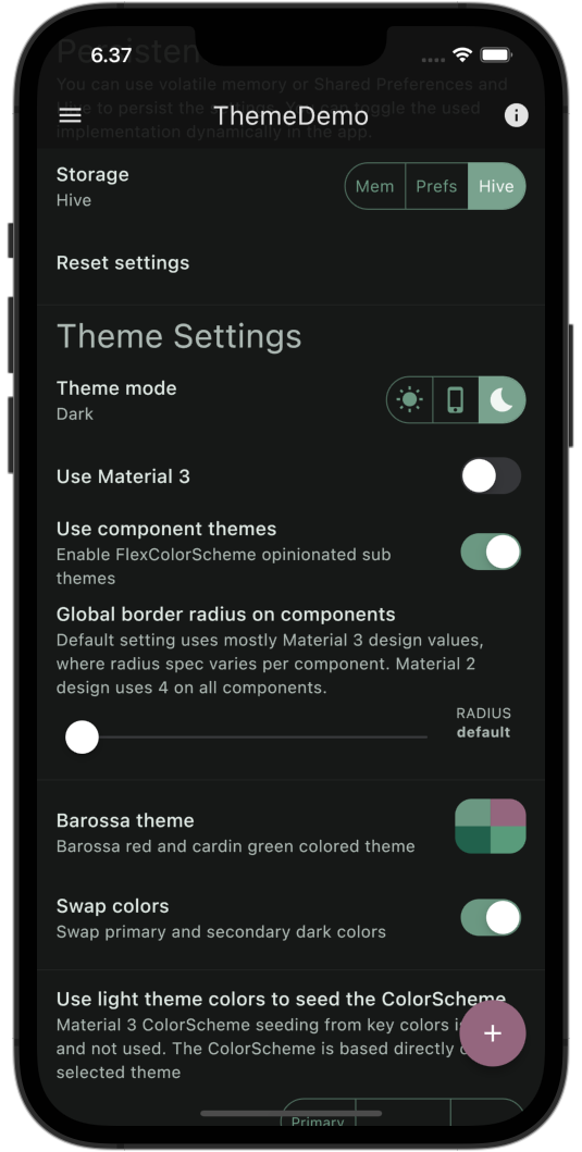
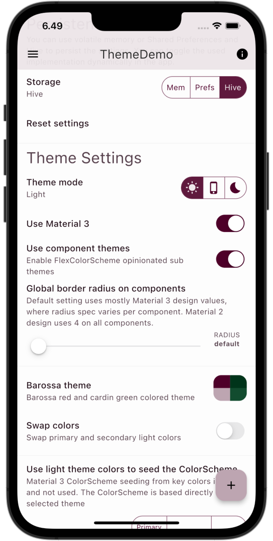
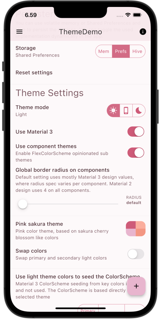
| Home Screen 1/4 | Home Screen 2/4 |
|---|---|
 |
 |
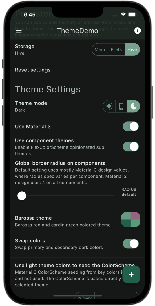
Features
The demo UI uses several ToggleButtons based widgets as well as SwitchListTile, Slider.adaptive and PopupMenuButton, to compose UI widgets used to change several input values for the used and demonstrated FlexColorScheme theming features.
The app demonstrates how the ThemeData, and ThemeMode states of the application can be easily managed using Riverpod, together with Providers and NotifierProviders. The providers are used to provide the current ThemeData for light and dark theme constructed by FlexColorScheme, as well as the theme mode state.
It also shows how simple it is to make small UI theme control widgets that can be dropped in anywhere, were needed in an app, and then used to manipulate and modify the ThemeData of the application. The UI view widgets modify Riverpod NotifierProviders, that act as theme property controllers in ThemeData providers. The MaterialApp widget watches these providers for changes, and the application is rebuilt using new ThemeData whenever a single theming UI widget is changed anywhere in the application.
| Home Screen 3/4 | Home Screen 4/4 |
|---|---|
 |
 |
Used MaterialApp
The MaterialApp setup is simple and compact. We give the light and dark ThemeData objects to their respective theme properties in the MaterialApp. Here they are given by providers that we watch for changes. Which of the currently supplied light and dark ThemeData objects gets used as active application theme, is controlled by the ThemeMode enum given to the themeMode property. We use and watch a third provider for this, so the theme mode can also easily be toggled via UI.
If you specify ThemeMode.system as themeMode, the application will follow the theme mode used by the host operating system. Many users like this option. Don’t just offer light and dark settings as options, also offer the mode system as a user choice. A very handy widget to use to allow the user to toggle ThemeMode between, light, dark and system mode is ToggleButtons.
The newer Material 3 component
SegementedButtoncan be used instead ofToggleButtons. However, with nice theming provided by FlexColorScheme, theToggleButtonsactually has some advantage in this use case and looks very similar toSegementedButton, while also matching the height and combined styles ofOutlinedButtonandFilledButton.ToggleButtonsis compacter and often simpler to use thanSegementedButton. In many other use casesSegementedButtonis superior though, so do look into it as well. In this app we prefer the simpler and more compactToggleButtonsfor the used UI examples.
class ThemeDemoApp extends ConsumerWidget {
  const ThemeDemoApp({super.key});

  @override
  Widget build(BuildContext context, WidgetRef ref) {
    return MaterialApp(
      debugShowCheckedModeBanner: false,
      scrollBehavior: const AppScrollBehavior(),
      title: AppConst.appName,
      theme: ref.watch(lightThemeProvider),
      darkTheme: ref.watch(darkThemeProvider),
      themeMode: ref.watch(Settings.themeModeProvider),
      initialRoute: HomePage.route,
      routes: <String, WidgetBuilder>{
        SplashPage.route: (BuildContext context) => const SplashPage(),
        ThemeShowcasePage.route: (BuildContext context) => const ThemeShowcasePage(),
        HomePage.route: (BuildContext context) => const HomePage(),
      },
    );
  }
}
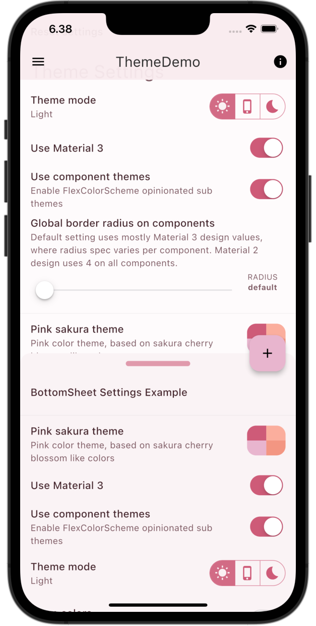
This setup and MaterialApp theming works regardless of where in the widget tree the actual theme UI controlling widgets are used. This is demonstrated by placing all made theme widget controls on the classic default Flutter counter page. Yes, there is still a counter on the example Home page. Some theme settings widgets are also used in the application Drawer, and even more can be found in a BottomSheet.
| Theme Control Widgets in App Drawer | Theme Control Widgets in a BottomSheet |
|---|---|
 |
 |
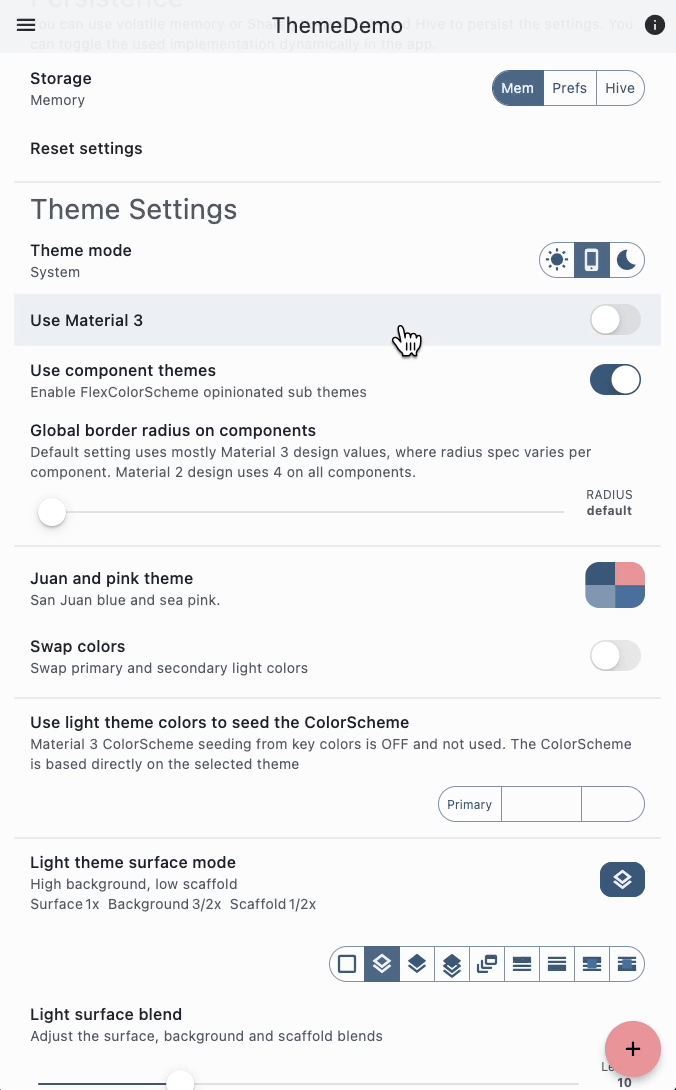
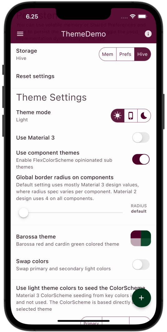
Dynamic Key-Value Database Switching
Another feature is that this demo persists all theme settings as they are changed. An interesting part is that the implementation used to persist the theme settings can be switched dynamically in the running app between:
- Memory, volatile, session based, settings not persisted
- Shared preferences
- Hive
This example shows how Riverpod can be used to change the used key-value database dependency from inside the Flutter app UI. This can be interesting to study, since this app needs this dependency to be able to read its settings and be able to start. Yet we can control this from inside the running Flutter app. In this scenario we are using Riverpod as a service locator and dependency injection replacement.
Is it really necessary to switch the key-value DB persistence implementation at runtime from inside the app? Well, maybe not, but the principle might be useful as an in-app development toggle, used during development and testing for other data sources, like using remote data and mock off-line data source. It can be useful to have a setup that allows you to do this, in-app from developer options. Plus, I wanted to see if it can be done with just Riverpod. Typically, I would have done this part with GetIt, but nice to see it can be done with just Riverpod.
To be able to do this with only Riverpod, we need to define a ProviderContainer in just plain Dart before we start the Flutter app. We can then access the provider that gives us the currently used key-value DB implementation. We can then perform whatever async initialization the used key-value DB may need.
Before we start the Flutter app, we also access a provider that sets up a listener that will run whenever the key-value DB provider is changed.
Below we also define a AppProviderObserver as a ProviderObserver. We use it to print debug logs whenever any provider in this app changes.
The main Function
The configurations of above features are done in the main function, and they look as follows:
Future<void> main() async {
  WidgetsFlutterBinding.ensureInitialized();
  // This container can be used to read providers before Flutter app is
  // initialized with UncontrolledProviderScope.
  final ProviderContainer container = ProviderContainer(
    // This observer is used for logging changes in all Riverpod providers.
    observers: <ProviderObserver>[AppProviderObserver()],
  );
  // Get default keyValueDb implementation and initialize it for use.
  await container.read(keyValueDbProvider).init();

  // By reading the keyValueDbListenerProvider, we instantiate it. This sets up
  // a listener that listens to state changes in keyValueDbProvider. In the
  // listener we can swap the keyValueDb implementation used in the app
  // dynamically between: Hive, SharedPreferences and volatile memory.
  container.read(keyValueDbListenerProvider);
  runApp(
    UncontrolledProviderScope(
      container: container,
      child: const ThemeDemoApp(),
    ),
  );
}
Providers in main
To provide keyValueDbProvider we use a StateProvider. Typically, a plain Provider would do if we just want to access one predefined concrete implementation. In this case we also want to define a listener that listens to changes in the keyValueDbProvider, so we can do some async init and data loading work when we change to another implementation from UI inside the Flutter app.
/// Provides a [KeyValueDb] DB repository.
///
/// The value returned depends on the controller [usedKeyValueDbProvider].
final StateProvider<KeyValueDb> keyValueDbProvider =
    StateProvider<KeyValueDb>((StateProviderRef<KeyValueDb> ref) {
  ref.onDispose(() {
    if (_debug) debugPrint('keyValueDbProvider: onDispose called');
  });
  return ref.watch(usedKeyValueDbProvider).get;
}, name: 'keyValueDbProvider');
I like to give Riverpod providers names using their
nameproperty, they are useful for debug purposes. For example, in theAppProviderObserverwe can use it to print the name of the provider that was changed.
The keyValueDbListenerProvider above in main is just a normal Provider, that we use to access KeyValueDbListener.
/// A provider used to read and activate a [KeyValueDbListener].
final Provider<KeyValueDbListener> keyValueDbListenerProvider =
    Provider<KeyValueDbListener>((ProviderRef<KeyValueDbListener> ref) {
  if (_debug) debugPrint('keyValueDbListenerProvider called');
  return KeyValueDbListener(ref);
});
Listener KeyValueDbListener Callback When DB is Changed
The act of reading the container.read(keyValueDbListenerProvider), will instantiate the KeyValueDbListener. In it, we will define a listener that allows us to listen for changes to the keyValueDbProvider and run a call-back that does the async work of initializing the new KeyValueDb we switched to.
/// A listener that listens to changes in the [keyValueDbProvider].
///
/// When the [keyValueDbProvider] state changes, we initialize the
/// new provided DB and read all its DB values and update UI settings
/// controls to the values from the new [KeyValueDb] implementation.
class KeyValueDbListener {
  // Pass a Ref argument to the constructor
  KeyValueDbListener(this.ref) {
    if (_debug) debugPrint('KeyValueDbListener: new instance');
    // Call _init as soon as the object is created
    _init();
  }
  final Ref ref;

  void _init() {
    if (_debug) debugPrint('KeyValueDbListener: _init() setup listen');
    // Listen to state changes in keyValueDbProvider.state.
    ref.listen<StateController<KeyValueDb>>(keyValueDbProvider.state,
        (StateController<KeyValueDb>? previous,
            StateController<KeyValueDb> current) async {
      // This callback executes when the keyValueDbProvider value changes.
      if (_debug) {
        debugPrint('KeyValueDbListener: listen called - - - - -');
        debugPrint('  DB switch : ${current.state}');
      }
      // Get the new un-initialized keyValueDb and initialize it.
      final KeyValueDb keyValueDb = current.state;
      await keyValueDb.init();
      // We changed key valued DB, we must update all settings controls.
      Settings.init(ref);
    });
  }
}
This approach is very similar to the one described by Andrea Bizzotto in his article “Flutter Riverpod: How to Register a Listener during App Startup”. In this solution, we do not need streams, since we are only listening to a change in a UI control used to select the used key-value DB implementation.
State Controller usedKeyValueDbProvider Used by UI to Change DB
The last part is that above in the keyValueDbProvider we watch usedKeyValueDbProvider and used the getter get in ref.watch(usedKeyValueDbProvider).get to get the user selected key-value DB implementation.
The usedKeyValueDbProvider is a simple StateProvider that holds an enum value called UsedKeyValueDb. We can use this usedKeyValueDbProvider and change its state value with for example a ToggleButtons UI widget.
/// A [StateProvider] controller used to control which [KeyValueDb]
/// implementation is used.
///
/// Used by UI widgets to select used [KeyValueDb] implementation.
final StateProvider<UsedKeyValueDb> usedKeyValueDbProvider =
    StateProvider<UsedKeyValueDb>(
  (final StateProviderRef<UsedKeyValueDb> ref) => AppDb.keyValue,
  name: 'usedKeyValueDbProvider',
);
Enhanced enum UsedKeyValueDb
The UsedKeyValueDb is an enhanced enum and its getter, get can be used to return the corresponding key-value DB implementation.
/// An enhanced enum used to represent, select and describe the used
/// [KeyValueDb] implementation.
enum UsedKeyValueDb {
  memory(),
  sharedPreferences(),
  hive(AppDb.keyValueFilename); // Used filename for the Hive storage box.

  final String _filename;
  const UsedKeyValueDb([this._filename = '']);

  /// Get the [KeyValueDb] implementation corresponding to the enum value.
  KeyValueDb get get {
    switch (this) {
      case UsedKeyValueDb.memory:
        return KeyValueDbMem();
      case UsedKeyValueDb.sharedPreferences:
        return KeyValueDbPrefs();
      case UsedKeyValueDb.hive:
        return KeyValueDbHive(_filename);
    }
  }
  /// Describe the [KeyValueDb] implementation corresponding to the enum value.
  String get describe {
    switch (this) {
      case UsedKeyValueDb.memory:
        return 'Memory';
      case UsedKeyValueDb.sharedPreferences:
        return 'Shared Preferences';
      case UsedKeyValueDb.hive:
        return 'Hive';
    }
  }
}
We could write the above with just functions or extensions based on a regular old Dart enum as well, but the above nicely encapsulates it, and the enum provides needed functions directly.
UI to Change Used Key-Value DB
Lastly, we need a bit of UI to actually change the used key-value DB implementation on the fly. We have three different options, so for this use case I like to use a simple ToggleButtons implementation that changes state provider usedKeyValueDbProvider.
/// UI used to toggle the used [KeyValueDb] implementation of the application.
///
/// This [ToggleButtons] UI control bakes in a Riverpod [StateProvider] and is
/// tied to this app implementation. This approach is however very easy to use
/// since there is nothing to pass around to use the UI widget.
/// Just drop in the const Widget anywhere in the app and use the UI control.
@immutable
class KeyValueDbToggleButtons extends ConsumerWidget {
  const KeyValueDbToggleButtons({super.key});

  @override
  Widget build(BuildContext context, WidgetRef ref) {
    final UsedKeyValueDb keyValueDb = ref.watch(usedKeyValueDbProvider);
    final List<bool> isSelected = <bool>[
      keyValueDb == UsedKeyValueDb.memory,
      keyValueDb == UsedKeyValueDb.sharedPreferences,
      keyValueDb == UsedKeyValueDb.hive,
    ];
    return ToggleButtons(
      isSelected: isSelected,
      onPressed: (int newIndex) {
        ref.read(usedKeyValueDbProvider.notifier).state =
            UsedKeyValueDb.values[newIndex];
      },
      children: const <Widget>[
        Padding(
          padding: EdgeInsets.symmetric(horizontal: 8.0),
          child: Text('Mem'),
        ),
        Padding(
          padding: EdgeInsets.symmetric(horizontal: 8.0),
          child: Text('Prefs'),
        ),
        Padding(
          padding: EdgeInsets.symmetric(horizontal: 8.0),
          child: Text('Hive'),
        ),
      ],
    );
  }
}
This ToggleButtons is small enough to even be dropped into the trailing property of a ListTile widget. For even more usage convenience, we make ListTile tapping work as a way to cycle through the toggle button’s options. This is very handy and easier to hit than tapping the options. We can still also select the options directly by tapping on them in the trailing ToggleButtons.
/// UI used to toggle the used key-value DB implementation by just tapping
/// on a ListTile to cycle through options.
class KeyValueDbListTile extends ConsumerWidget {
  const KeyValueDbListTile({super.key});

  @override
  Widget build(BuildContext context, WidgetRef ref) {
    final String usedDb = ref.watch(usedKeyValueDbProvider).describe;
    return ListTile(
      title: const Text('Storage'),
      subtitle: Text(usedDb),
      trailing: const KeyValueDbToggleButtons(),
      onTap: () {
        switch (ref.read(usedKeyValueDbProvider.notifier).state) {
          case UsedKeyValueDb.memory:
            ref.read(usedKeyValueDbProvider.notifier).state =
                UsedKeyValueDb.sharedPreferences;
            break;
          case UsedKeyValueDb.sharedPreferences:
            ref.read(usedKeyValueDbProvider.notifier).state =
                UsedKeyValueDb.hive;
            break;
          case UsedKeyValueDb.hive:
            ref.read(usedKeyValueDbProvider.notifier).state =
                UsedKeyValueDb.memory;
            break;
        }
      },
    );
  }
}
This is what it looks like in action. It behaves like a SwitchListTile, where you can either tap the entire tile or the switch, but in this case with three options instead of just an ON/OFF switch.
Using UI to dynamically change the used key-value DB implementation.
Above, the themed ToggleButtons look different when the key-value DB implementation is switched. This is because different theme settings defined with FlexColorScheme, had been configured using the different key-value DB implementations. When we switch implementation, the settings persisted in each implementation is loaded and the theme changes to it.
That’s it for being able to switch in different key-value DB implementation using only Riverpod. Perhaps there is an easier way, but this worked well and that was the aim of this part of the demo. How useful it is depends on what you use it for. The key-value database swapping used in this example, is perhaps not the most relevant use case.
Use Cases
The technique demonstrated above to change the key-value database on the fly, from a toggle inside the running application, has more interesting use cases. It can, for example, also be used to swap in mock, test and development instances of any data sources that your application needs and uses. This can be handy for both development and demonstration purposes. It can enable you to develop and demo your application off-line, even if it normally requires an on-line data source. You could also add mock data sources, that contain customer relevant example mock data, that you can change to when you demonstrate the application.
Persistence Design Requirements
One of the goals with the design of the used key-value persistence model and Riverpod providers using it, was that each settings entry value should be saved with its own key string. When you change a setting, only the value for this key should be persisted, and only the widget that toggles this value is rebuilt. This was desired mostly for storage efficiency and for speed when modifying theme settings interactively. When a theme settings widget change application theme properties, it typically results in a new ThemeData object, which requires rebuilding the app UI anyway with the new effective ThemeData. So the UI rebuild efficiency is perhaps not so critical.
We could also serialize a big settings class with all the properties to a JSON and save the entire JSON with just one key. We would then be writing the entire “large” JSON file to the key-value DB, every time a single settings value is changed. This was not desired.
We also did not want to use a Freezed or handwritten immutable class with all the settings properties in it. Then we would also have to use a select filter for every property in every widget using a settings entry, to ensure it is rebuilt only when its value is changed. We would also need to filter to store only the property value that was changed into the used key-value DB. In this case, we wanted to avoid this approach. Using select is a bit more involved or at least verbose. In our “Settings” feature, we need and want full reactive behavior for all of its members. This is a bit different from a normal data class. In them, we typically only need it for a few of its members and for the rest, it is OK to update the entire class state as a “record” into the database, in a single JSON doc. However, that fit poorly with how we wanted the settings to behave in this application.
Maybe later we will add a ThemeDemo branch that uses Freezed and
myProvider.select()approach. It could be an interesting article to compare them and discuss pros and cons with both.
For the settings entry properties, we could alternatively use just simple StateProviders. I have done so before, it works well. However, if we use Notifier and NotifierProvider, we have more control and can make an API for our settings entries that provides functions that reads very nicely when we use them.
When the app starts, it should set the state for each stored value entry, by checking if its key exists in the key-value DB. If it exists, then this previously persisted value is used as start value. If the key did not exist, then a hard-coded constant default value for the settings entry value in question is used.
Key-Value Database
For the key-value database that persists the settings, we use an abstract interface and offer three concrete implementations. One using a Map, and two using popular Flutter packages for storing simple key-value based data.
- KeyValueDb - Abstract interface.
- KeyValueDbMem - Volatile memory implementation, just a
Map. - KeyValueDbPrefs – SharedPreferences implementation.
- KeyValueDbHive - Hive implementation.
It would be straight forward to add more key-value-based storage implementations. Maybe even add one that uses the local implementation as off-line cache, and also persist same settings in a cloud-based implementation. Cloud authenticated users could then bring their preferences with them when they switch to another device or platform, and it would also work off-line.
Typically, you would of course only have one key-value db implementation for storing settings, and use this repository abstraction to limit the places where you interface with the actual storage solution. It also enables swapping it out easily, should it ever be needed. In practice, it is seldom needed in the life-span of most applications, but hey we like over-engineered solutions.
Abstract Key-Value DB Interface
The needed interface for the key-value database in this demo is straightforward. It is the same as the one used in the FlexColorScheme example applications. In its entirety, it looks like this:
/// Abstract interface for the [KeyValueDb] used to get and put (save) simple
/// key-value pairs.
abstract class KeyValueDb {
  /// A [KeyValueDb] implementation may override this method to perform
  /// all its needed initialization and setup work.
  Future<void> init();

  /// A [KeyValueDb] implementation may override this method to perform
  /// needed cleanup on close and dispose.
  Future<void> dispose();

  /// Get a `value` from the [KeyValueDb], using string `key` as its key.
  ///
  /// If `key` does not exist in the repository, return `defaultValue`.
  T get<T>(String key, T defaultValue);

  /// Put "save" a `value` in the [KeyValueDb] service, using `key` as its
  /// storage key.
  Future<void> put<T>(String key, T value);
}
Memory Key-Value DB Implementation
To make a simple naive memory and session based key-value DB, we can use a Map. In this case we also wanted the key-value pairs to be kept when we switch between implementations, even if the keyValueDbProvider makes a new instance it. We could have made KeyValueDbMem itself a singleton, DB’s often are, but all we actually needed was for it to have a private static map.
// Set the bool flag to true to show debug prints. Even if you forgot
// to set it to false, debug prints will not show in release builds.
// The handy part is that if it gets in the way in debugging, it is an easy
// toggle to turn it off here for just this feature. You can leave it true
// below to see this feature's logs in debug mode.
const bool _debug = !kReleaseMode && true;

/// A repository that stores and retrieves key-value settings pairs from
/// volatile ram memory.
///
/// This class keeps the key-value pairs in a private static final Map during
/// app execution, so we can get the same Map data also when we get a
/// new instance of the mem key-value db, this happens when we dynamically in
/// the app switch to another implementation and back to mem again.
class KeyValueDbMem implements KeyValueDb {
  // A private static Map that stores the key-value pairs.
  //
  // This is kept in memory as long as app runs, not so pretty, but simple.
  // We could make the entire class a singleton too, but we don't need to, this
  // works well enough for this demo.
  static final Map<String, dynamic> _memKeyValueDb = <String, dynamic>{};

  /// [KeyValueDbMem] implementation needs no init functionality.
  @override
  Future<void> init() async {
    if (_debug) debugPrint('KeyValueDbMem: init called');
  }
  /// [KeyValueDbMem] implementation needs no dispose functionality.
  @override
  Future<void> dispose() async {
    if (_debug) debugPrint('KeyValueDbMem: dispose called');
  }

  /// Get a settings value from the mem db, using [key] to access it.
  ///
  /// If key does not exist, return the [defaultValue].
  @override
  T get<T>(String key, T defaultValue) {
    try {
      if (_memKeyValueDb.containsKey(key)) {
        final T value = _memKeyValueDb[key] as T;
        if (_debug) {
          debugPrint('MemDB get   : ["$key"] = $value (${value.runtimeType})');
        }
        if (value == null) {
          return null as T;
        } else {
          return value;
        }
      } else {
        return defaultValue;
      }
    } catch (e) {
      debugPrint('MemDB get (load) ERROR');
      debugPrint(' Error message ...... : $e');
      debugPrint(' Store key .......... : $key');
      debugPrint(' defaultValue ....... : $defaultValue');
    }
    // If something went wrong we return the default value.
    return defaultValue;
  }

  /// Put a settings [value] to the mem db, using [key], as key for the value.
  @override
  Future<void> put<T>(String key, T value) async {
    if (_debug) {
      debugPrint('MemDB put   : ["$key"] = $value (${value.runtimeType})');
    }
    _memKeyValueDb[key] = value;
  }
}
To make it easy to track what is happening in the app, this class and many others shown earlier above and later too, as well as many providers, include debugPrints that shows what is happening on the console. The debug prints are behind a _debug flag that can be toggled on/off individually for each file/feature. The flag is always automatically toggled off in a release build, so we can never forget it on.
SharedPreferences and Hive Key-Value DB Implementations
The used SharedPreferences and Hive key-value database implementations are the same as the ones used in the FlexColorScheme example applications. They also have the same requirement that we need to be able to store a null settings entry value. Using null values in Flutter SDK themes have the meaning that we want the widget’s default un-themed behavior.
We cannot use the absence of a key in the key-value database to represent null. No key found, gives us our coded const default value for a theme setting. This is typically not null, but it might be, and even if it is not, we might in some cases want to be able to select a default null choice, to get the SDK default null un-themed behavior. In this demo, the AppBar style Default below is one example of that.
| AppBar Style Nullable 1/2 | AppBar Style Nullable 2/2 |
|---|---|
 |
 |
To be able to do this, we need to be able to persist nullable values in the key-value DB. The used map for our volatile memory storage allows us to do that, as does Hive. However, SharedPreferences does not support storing null at all. So its implementation includes a work-around to use some other suitable value to represent the persisted null choice and return null back to us when that value is found.
Both the Hive and the Shared Preferences implementations also include converters to persist different enum’s in a type safe way, and Color as ìnt values. Hive provides its own TypeAdapter class that allows us to do so. For the SharedPreferences implementation, we baked in the type-conversions.
Obviously, to add support for any additional type-safe data types, we must add handling of them to our Hive and Shared Preferences implementations.
We won’t go through these implementations here, but you can find the Hive one here and the SharedPreferences one here, if you want to study them. The one for Shared Preferences is a bit longer (almost double), in order to handle both the occasionally needed nullable types, and the type conversions.
Settings
The settings approach used in this demo might be considered a bit controversial. I like it for the simple setup needed when persisting and using all the individual key-value pair controllers; that update UI and DB only when its value changes. Since it gives each Settings entry value its own provider, it is simple to use it in UI widgets.
The used Settings class is actually only a static container class. We could just as well have it all as top level const and final values. Wrapping them in a Settings class, name spaces them and encapsulates them nicely. Basically, this is like using classes to wrap app config constant values. Dart guide says don’t do this, I say do. Even the Flutter repo uses them, so in my lint rules I also allow them, in fact I like and prefer them. Do it for the global name spacing and nice code completion it gives you when using them. This demo app also uses this for a number application constants in several AppNnnn const classes, you can find them in the core\constants folder.
In the Settings statics only class, we basically have the following:
- Private static constants for the settings entry default values.
- Private static constant string keys for all the settings entry DB keys.
- A static function to
resetall settings to their default values. - A static function to
initall settings entry values to the values they have in the DB. - A static final
NotifierProviderof typeSettingsEntryfor every settings value.
We can see this below, where, as an example, three settings-value implementations are presented:
/// A static container class for all our settings providers, default values and
/// used key-value DB keys.
class Settings {
  Settings._();
  // Defaults for: use material 3, theme mode and active color scheme.
  static const bool _useMaterial3 = false;
  static const ThemeMode _themeMode = ThemeMode.system;
  static const int _schemeIndex = 0;
  // 8< - - - snip, repetitive const code cut. - - -

  /// Reset all settings entries and their controllers to their default values.
  ///
  /// This action is triggered by the user when they want to reset all settings
  /// values to their app default values.
  static void reset(WidgetRef ref) {
    if (_debug) debugPrint('Settings: resetAll DB values');
    // Use material 3, theme mode and active color scheme.
    ref.read(useMaterial3Provider.notifier).reset();
    ref.read(themeModeProvider.notifier).reset();
    ref.read(schemeIndexProvider.notifier).reset();
    // 8< - - - snip, repetitive reset code cut. - - -
  }

  /// Init all settings entries and their controllers to values from used
  /// key-value DB.
  ///
  /// This is typically only used after switching DB implementation dynamically.
  static void init(Ref ref) {
    if (_debug) debugPrint('Settings: init DB values');
    // Use material 3, theme mode and active color scheme.
    ref.read(useMaterial3Provider.notifier).init();
    ref.read(themeModeProvider.notifier).init();
    ref.read(schemeIndexProvider.notifier).init();
    // 8< - - - snip, repetitive init code cut. - - -
  }

  /// String key used for defining if we use Material 3 or Material 2.
  static const String _keyUseMaterial3 = 'useMaterial3';
  /// Provider for swapping between using Material 2 and 3 mode.
  static final NotifierProvider<SettingsEntry<bool>, bool>
      useMaterial3Provider = NotifierProvider<SettingsEntry<bool>, bool>(
    () {
      return SettingsEntry<bool>(
        defaultValue: _useMaterial3,
        key: _keyUseMaterial3,
      );
    },
    // Use the unique key-value DB key as provider name, useful for debugging.
    name: '${_keyUseMaterial3}Provider',
  );

  /// String key used for storing the last used app theme mode.
  static const String _keyThemeMode = 'themeMode';
  /// The themeModeProvider represents a [StateProvider] to provide the state of
  /// the [ThemeMode], so to be able to toggle the application wide theme mode.
  static final NotifierProvider<SettingsEntry<ThemeMode>, ThemeMode>
      themeModeProvider = NotifierProvider<SettingsEntry<ThemeMode>, ThemeMode>(
    () {
      return SettingsEntry<ThemeMode>(
        defaultValue: _themeMode,
        key: _keyThemeMode,
      );
    },
    name: '${_keyThemeMode}Provider',
  );

  /// String key for storing theme settings index.
  static const String _keySchemeIndex = 'schemeIndex';

  /// The index provider of the currently used color scheme and theme.
  static final NotifierProvider<SettingsEntry<int>, int> schemeIndexProvider =
      NotifierProvider<SettingsEntry<int>, int>(
    () {
      return SettingsEntry<int>(
        defaultValue: _schemeIndex,
        key: _keySchemeIndex,
      );
    },
    // Use the unique key-value DB key as provider name, useful for debugging.
    name: '${_keySchemeIndex}Provider',
  );

  // 8< - - - snip, repetitive code for similar SettingsEntry cut. - - -
}
All the above are just static definitions, sure there is quite a bit of them, but it is
pretty straight forward. The SettingsEntry based NotifierProvider providers may look a bit complex, perhaps it is because this code base uses lint rules that requires you to explicitly always specify all types.
Let’s examine the SettingsEntry class to better understand what is happening in it.
Settings Entry
The SettingsEntry class is an extension of the Notifier class, which is a bit simpler to use than the StateNotifier. It is also a generic, so we can use it with arbitrary data types. The generic types we can use do however have the limitation that they also have to be supported by our used KeyValueDb implementations.
When we use the Notifier class instead of StateNotifier, we do not need to pass our SettingsEntry a Riverpod Ref object, that we need to find and read the currently used KeyValueDb implementation via the keyValueDbProvider. The ref is available as a property to all Notifier subclasses, we do no need to pass it in. If we use StateNotifier we have to pass it a ref.
The SettingsEntry class requires a default value of same generic type <T>, that we will use to tell the DB to return if there is no value stored for the String key, that is also required and used to get the stored settings value for this entry.
When we read a NotifierProvider of type SettingsEntry, it will be instantiated and initialized with appropriate start value via its init() method, by getting a value either from the key-value DB, if it had a value stored for the used key, or via the provided defaultValue.
We also define a set(T newValue) function that will update both the state of the provider, and the key-value DB entry to the new value.
/// A persisted app settings entry class.
///
/// Can be of any value type that the used key-value DB implementation supports.
class SettingsEntry<T> extends Notifier<T> {
  SettingsEntry({
    required this.key,
    required this.defaultValue,
  });

  /// The default value of the Settings entry, used if no value in ke-value DB
  /// exists.
  final T defaultValue;

  /// The key used to retrieve the settings entry value from the key-value DB.
  final String key;

  /// Creating the Notifier sets state to [defaultValue] runs [init] and
  /// returns state.
  ///
  /// In [init] if key-value db had a value with given key, it sets state to
  /// it, else it sets state to [defaultValue].
  @override
  T build() {
    // To make sure the Notifier's state is initialized start by giving it,
    // a default value.
    state = defaultValue;
    init();
    return state;
  }

  /// Init the settings entry from the used key-value DB implementation.
  void init() {
    // Get the used-key value DB implementation.
    // Notifier has access to ref directly, new and handy in Riverpod 2.
    final KeyValueDb db = ref.read(keyValueDbProvider);
    // Read the value for the provided key from the used key-value DB.
    // The db value get returns the default value if key does not exist in it.
    final T newValue = db.get(key, defaultValue);
    // Only set state to db value if it is different from current value.
    if (state != newValue) state = newValue;
  }

  /// Update the settings state with a new value.
  ///
  /// If the new value is different from current state value:
  /// - Assign new value to current state.
  /// - Persist the value to the used-key value DB implementation.
  void set(T newValue) {
    if (state == newValue) return;
    state = newValue;
    final KeyValueDb db = ref.read(keyValueDbProvider);
    unawaited(db.put(key, newValue));
  }

  /// Rest a settings entry state to its default value.
  ///
  /// If it already is at its default value, do nothing, return.
  /// - Set state to default value.
  /// - Update the key-value DB value entry for this key, to its default value.
  void reset() {
    if (state == defaultValue) return;
    state = defaultValue;
    final KeyValueDb db = ref.read(keyValueDbProvider);
    unawaited(db.put(key, defaultValue));
  }
}
Application UI
We won’t be going through the entire application’s user interface code. It is not so exiting, but let’s look at a few examples of making and using UI widgets that use the providers in the Settings class.
Use Material 3 Switch
Let’s start with a simple example. There is a theme switch in the UI. It allows us to toggle if we use Material 3 or Material 2 Flutter theming. The switch UI is based on the SwitchListTile widget and setting its value and changing it, becomes this simple:
class UseMaterial3Switch extends ConsumerWidget {
  const UseMaterial3Switch({super.key});

  @override
  Widget build(BuildContext context, WidgetRef ref) {
    return SwitchListTileAdaptive(
      title: const Text('Use Material 3'),
      value: ref.watch(Settings.useMaterial3Provider),
      onChanged: ref.read(Settings.useMaterial3Provider.notifier).set,
    );
  }
}
It is easy to see with a little of Riverpod insights that the switch value will change as soon as the ref.watch(Settings.useMaterial3Provider) changes its state value.
You may first think that the onChanged callback function ref.read(Settings.useMaterial3Provider.notifier).set looks unfamiliar. It is however only a tear-off using the set method of the provider, which in this case will also be a function that takes a bool value, matching the signature of the switch onChanged callback. The notifier on the ref.Read on the Settings.useMaterial3Provider returns the underlying notifier, in this case Notifier<Bool>, we can then use its methods, in this case set(bool newValue).
For the UI we end with a simple const constructor widget, that needs no properties. We can drop it in as a widget wherever we want to control this setting in the application’s user interface. We can use it on any screen, dialog, drawer, bottom sheet, etc. When the switch is toggled, the updated settings value will be persisted and the application theme will change to reflect the new theme result.
Could not be simpler to use, but admittedly to get to this simplicity takes a bit of abstractions, setup and Riverpod definitions.
You might have noticed that the UI widget above uses a
SwitchListTileAdaptivewidget. This is an elementary wrapper forSwitchListTile.adaptive. Why is it needed? To find out why, check out its code and comments here. Hint: It is a Cupertino-switch theming limitation.
Active Theme Mode ToggleButtons
Let’s look at another example. Toggling the theme mode from light, to dark and also optionally choosing the system mode. The property defining this in the MaterialApp is a ThemeMode enum value. Since we made our key-value DB support this type, and we made a Settings.themeModeProvider using a SettingsEntry of type <ThemeMode> for it, we can make a simple ToggleButtons 3-state switch for it.
class ThemeModeToggleButtons extends ConsumerWidget {
  const ThemeModeToggleButtons({super.key});

  @override
  Widget build(BuildContext context, WidgetRef ref) {
    final ThemeMode themeMode = ref.watch(Settings.themeModeProvider);
    final List<bool> isSelected = <bool>[
      themeMode == ThemeMode.light,
      themeMode == ThemeMode.system,
      themeMode == ThemeMode.dark,
    ];
    return ToggleButtons(
      isSelected: isSelected,
      onPressed: (int newIndex) {
        if (newIndex == 0) {
          ref.read(Settings.themeModeProvider.notifier).set(ThemeMode.light);
        } else if (newIndex == 1) {
          ref.read(Settings.themeModeProvider.notifier).set(ThemeMode.system);
        } else {
          ref.read(Settings.themeModeProvider.notifier).set(ThemeMode.dark);
        }
      },
      children: const <Widget>[
        Icon(AppIcons.lightTheme),
        Icon(AppIcons.systemTheme),
        Icon(AppIcons.darkTheme),
      ],
    );
  }
}
The ToggleButtons has a quite simple but flexible model for toggling its buttons’ state. We just need a bit of logic for it. In this case we also wanted the buttons to have the order, light, system, dark. If we had been happy with the ThemeMode mode enum values order system, light, dark we could have made it a bit simpler.
This ToggleButtons already work as is, it is also small enough to use it as a trailing widget in a ListTile. However, when I see and use a ListTile I like its onTap callback to do something useful. In this case we can make it to a lazy user’s option for hitting a big UI target and cycling through the ThemeModes. Below is a handy ListTile widget for this. We can set its title if we need a shorter version in tight places. The subtitle is the active theme mode enum name using sentence-case. For the onTap callback we cycle through the modes in desired order. As trailing widget we just give the above ThemeModeToggleButtons, we don’t have to do anything else, its button state will also automatically update when we change the mode of same Settings.themeModeProvider in using the ListTile onTap callback.
class ThemeModeListTile extends ConsumerWidget {
  const ThemeModeListTile({this.title, super.key});
  final Widget? title;

  @override
  Widget build(BuildContext context, WidgetRef ref) {
    final ThemeMode mode = ref.watch(Settings.themeModeProvider);
    return ListTile(
      title: title,
      subtitle: Text(mode.name.sentenceCase()),
      onTap: () {
        switch (ref.read(Settings.themeModeProvider)) {
          case ThemeMode.light:
            ref.read(Settings.themeModeProvider.notifier).set(ThemeMode.system);
            break;
          case ThemeMode.system:
            ref.read(Settings.themeModeProvider.notifier).set(ThemeMode.dark);
            break;
          case ThemeMode.dark:
            ref.read(Settings.themeModeProvider.notifier).set(ThemeMode.light);
            break;
        }
      },
      trailing: const ThemeModeToggleButtons(),
    );
  }
}
Reactive UI Widgets
From the above example, we can already see that we can easily make reactive UI widgets with Riverpod. Using these Riverpod provider driven UI widgets, make our UI widgets react to change in their values, regardless of where and when we change their Riverpod provider-based controllers. Additionally, using the UI control widgets anywhere in the app’s widget tree is as simple as dropping in the UI widget. To see this in action, take a look at this screen recording of the app.
Demo of UI widgets in the background, updating when their values are manipulated elsewhere.
In this example, we see two UI widgets being used, one for setting using Material 3 theming, and another one for opting in and out of using FlexColorScheme opinionated widget component themes.
These widgets are first toggled on the Home screen, then from the app Drawer and a from a BottomSheet. As we toggle them from these other UI locations, the application theme of course changes accordingly and settings are persisted, but we also see the same UI controls visible in the background Home screen update as well to the new value we set in the Drawer and the BottomSheet. This happened without us having to think about adding any extra update handling into our UI widgets or handling events. We already handle it, with the Riverpod providers we defined.
Theme Providers
Lastly let’s look at how the application theme and ThemeData is made. This demo does not have all the dynamic theming features that the FlexColorScheme Themes Playground does, but it packs a pretty heavily configurable theming punch too. We can also easily add more user-controlled and persisted theming features.
We already in the MaterialApp saw that we used two providers, lightThemeProvider and darkThemeProvider to provide the ThemeData to the MaterialApp’s light theme and dark darkTheme properties. These providers are vanilla providers, that use a static functions that return ThemeData. The functions are passed parameters that are watchers of our Settings entry providers.
Sounds complicated? It is not, the provider of the light theme looks like this:
final Provider<ThemeData> lightThemeProvider = Provider<ThemeData>(
  (ProviderRef<ThemeData> ref) {
    // Make an always valid FlexTones config getter from our unsafe int.
    final bool useSeed = ref.watch(Settings.usePrimaryKeyColorProvider);
    final int flexTone = ref.watch(Settings.usedFlexToneProvider);
    final int usedFlexTone =
      flexTone < 0 || flexTone >= FlexTone.values.length || !useSeed ? 0 : flexTone;

    return AppTheme.light(
      useMaterial3: ref.watch(Settings.useMaterial3Provider),
      usedTheme: ref.watch(Settings.schemeIndexProvider),
      swapColors: ref.watch(Settings.lightSwapColorsProvider),
      surfaceMode: ref.watch(Settings.lightSurfaceModeProvider),
      blendLevel: ref.watch(Settings.lightBlendLevelProvider),
      //
      usePrimaryKeyColor: useSeed,
      useSecondaryKeyColor: ref.watch(Settings.useSecondaryKeyColorProvider),
      useTertiaryKeyColor: ref.watch(Settings.useTertiaryKeyColorProvider),
      usedFlexTone: usedFlexTone,
      //
      appBarElevation: ref.watch(Settings.appBarElevationProvider),
      appBarStyle: ref.watch(Settings.lightAppBarStyleProvider),
      appBarOpacity: ref.watch(Settings.lightAppBarOpacityProvider),
      transparentStatusBar: ref.watch(Settings.transparentStatusBarProvider),
      //
      useSubTheme: ref.watch(Settings.useSubThemesProvider),
      defaultRadius: ref.watch(Settings.defaultRadiusProvider),
      //
      platform: ref.watch(platformProvider),
    );
  },
  name: 'lightThemeProvider',
);
The one for the dark theme is equivalent and not shown here.
Application Theme
The AppTheme is a simple class, with only static functions and constants. The core functions are the AppTheme.light and AppTheme.dark ones. The rest is just constants to define some example custom theme colors, and to build a const list that contains all available color themes we can switch between.
The AppTheme.light and AppTheme.dark functions are pretty equivalent, the dark theme has a few more parameters. Some used parameters share the Settings providers, but in cases where it makes sense, we have separate Settings providers for the light and dark theme, so light and dark theme parameters can be controlled and configured separately.
We could of course combine the above theme providers with the actual ThemeData factory constructors used to return the ThemeData object. However, for separation I prefer this approach. The theme providers only provides the ThemeData and listens to values that impact the theme data result. The AppTheme constructors actually makes the complex ThemeData object.
In this case we are using FlexColorScheme to construct the fancy ThemeData object, but we could easily swap it out with just vanilla ThemeData or something else, without messing with our provider of ThemeData.
/// The themes for this app are defined here.
class AppTheme {
  AppTheme._();

  static ThemeData light({
    required bool useMaterial3,
    required int usedTheme,
    required bool swapColors,
    required FlexSurfaceMode surfaceMode,
    required int blendLevel,
    required bool usePrimaryKeyColor,
    required bool useSecondaryKeyColor,
    required bool useTertiaryKeyColor,
    required int usedFlexTone,
    required double appBarElevation,
    required FlexAppBarStyle? appBarStyle,
    required double appBarOpacity,
    required bool transparentStatusBar,
    required bool useSubTheme,
    required double? defaultRadius,
    required TargetPlatform platform,
  }) {
    return FlexThemeData.light(
      useMaterial3: useMaterial3,
      colors: schemes[usedTheme].light,
      swapColors: swapColors,
      surfaceMode: surfaceMode,
      blendLevel: blendLevel,
      keyColors: FlexKeyColors(
        useKeyColors: usePrimaryKeyColor,
        useSecondary: useSecondaryKeyColor,
        useTertiary: useTertiaryKeyColor,
      ),
      tones: FlexTone.values[usedFlexTone].tones(Brightness.light),
      appBarElevation: appBarElevation,
      appBarStyle: appBarStyle,
      appBarOpacity: appBarOpacity,
      transparentStatusBar: transparentStatusBar,
      subThemesData: useSubTheme
        ? FlexSubThemesData(
            defaultRadius: defaultRadius,
            thinBorderWidth: 1,
            thickBorderWidth: 2)
        : null,
      visualDensity: FlexColorScheme.comfortablePlatformDensity,
      fontFamily: AppFonts.mainFont,
      typography: Typography.material2021(platform: platform),
      platform: platform,
    );
  }
  // Above we used `FlexThemeData.light`, but for illustration purposes
  // FlexColorScheme.light() and its `toTheme` method is used in the actual code.

  // 8< snip - - - dark theme and a bunch of const values removed.
}
Provider Observer
In the main function in the beginning of this article we saw this line:
observers: <ProviderObserver>[AppProviderObserver()],
Where we define a ProviderObserver called AppProviderObserver(). Since we did it in our top provider container, it allows us to observe changes in all our providers. We can use this to make a simple Riverpod provider logger for our app, that observes all state changes in all the providers we use.
We are not doing any fancy logging in this demo, but even a simple ProviderBase debug logger like this can be very useful.
// Set the bool flag to true to show debug prints. Even if you forgot
// to set it to false, debug prints will not show in release builds.
// The handy part is that if it gets in the way in debugging, it is an easy
// toggle to turn it off here for just this feature. You can leave it true
// below to see this features logs in debug mode.
const bool _debug = !kReleaseMode && true;
/// AppProviderObserver represents a provider observer for changes in any
/// providers. If not in release mode, it debugPrints the changes.
class AppProviderObserver extends ProviderObserver {
  AppProviderObserver();

  @override
  Future<void> didUpdateProvider(
      ProviderBase<dynamic> provider,
      Object? previousValue,
      Object? newValue,
      ProviderContainer container) async {
    if (_debug) {
      debugPrint('PROVIDER    : ${provider.name ?? '<NO NAME>'}\n'
          '  Type      : ${provider.runtimeType}\n'
          '  Old value : $previousValue\n'
          '  New value : $newValue');
    }
  }
}
To make it give us a bit more information, we show the provider name and its runtimeType in the observer’s debugPrint, together with its previous and new value.
Logging with the Observer
Let’s take a look at what our debug logs look in our ThemeDemo application when we start the app.
On app startup we see the selection of the default key-value DB implementation, which is the Hive implementation. We see its local storage path and filename setup. We also see the configuration of the listener. These logs come from other debugPrints in the app.
flutter: KeyValueDbHive: init called, _isInitialized = false
flutter: KeyValueDbHive storage path: /Users/rydmike/Library/Containers
          /com.example.themeDemo/Data/Library/Application Support/com.example.themeDemo and
          file name: settings_box
flutter: keyValueDbListenerProvider called
flutter: KeyValueDbListener: new instance
flutter: KeyValueDbListener: _init() setup listen
Next we see the Hive DB value getters telling us what values it got. These debugPrint logs comes from the Hive key-value DB implementation.
flutter: Hive get    : ["usePrimaryKeyColor"] = false (bool)
flutter: Hive get    : ["usedFlexTone"] = 1 (int)
flutter: Hive get    : ["useMaterial3"] = false (bool)
flutter: Hive get    : ["schemeIndex"] = 29 (int)
flutter: Hive get    : ["lightSwapColors"] = false (bool)
flutter: Hive get    : ["lightSurfaceMode"] = FlexSurfaceMode.highBackgroundLowScaffold (FlexSurfaceMode)
flutter: Hive get    : ["lightBlendLevel"] = 5 (int)
flutter: Hive get    : ["useSecondaryKeyColor"] = false (bool)
flutter: Hive get    : ["useTertiaryKeyColor"] = false (bool)
flutter: Hive get    : ["appBarElevation"] = 0.0 (double)
flutter: Hive get    : ["lightAppBarStyle"] = null (Null)
flutter: Hive get    : ["lightAppBarOpacity"] = 0.95 (double)
flutter: Hive get    : ["transparentStatusBar"] = true (bool)
flutter: Hive get    : ["useSubThemes"] = true (bool)
flutter: Hive get    : ["defaultRadius"] = null (Null)
flutter: Hive get    : ["darkSwapColors"] = false (bool)
flutter: Hive get    : ["darkSurfaceMode"] = FlexSurfaceMode.highBackgroundLowScaffold (FlexSurfaceMode)
flutter: Hive get    : ["darkBlendLevel"] = 25 (int)
flutter: Hive get    : ["darkAppBarStyle"] = null (Null)
flutter: Hive get    : ["darkAppBarOpacity"] = 0.91 (double)
flutter: Hive get    : ["darkIsTrueBlack"] = false (bool)
flutter: Hive get    : ["darkComputeTheme"] = false (bool)
flutter: Hive get    : ["darkComputeLevel"] = 20 (int)
flutter: Hive get    : ["themeMode"] = ThemeMode.light (ThemeMode)
That was it, we now have our app running. We can see the active theme. It is in light mode:
Next let’s only tap the Theme mode control and change from current light theme mode to dark. We can then see this log coming from the AppProviderObserver:
flutter: PROVIDER    : themeModeProvider
flutter:   Type      : NotifierProviderImpl<SettingsEntry<ThemeMode>, ThemeMode>
flutter:   Old value : ThemeMode.light
flutter:   New value : ThemeMode.dark
flutter: Hive put    : ["themeMode"] = ThemeMode.dark (ThemeMode)
The themeModeProvider changed from light to dark and Hive persisted the new value. Our theme in the app also changed from a light theme, to a dark theme, but we observed no change in ThemeData provided to the MaterialApp, it only internally swapped to using the already defined dark mode ThemeData, and the MaterialApp then got rebuilt with the already provided darkTheme we had defined when the app was started. The least amount of data changed and minimum possible rebuild for the change happened, as we wanted.

Let’s then try to toggle something that will only affect the dark theme. The Swap colors for the dark primary and secondary colors is good simple choice for this. Let’s tap it and see what happens:
flutter: PROVIDER    : darkSwapColorsProvider
flutter:   Type      : NotifierProviderImpl<SettingsEntry<bool>, bool>
flutter:   Old value : false
flutter:   New value : true
flutter: Hive put    : ["darkSwapColors"] = true (bool)
flutter: PROVIDER    : darkThemeProvider
flutter:   Type      : Provider<ThemeData>
flutter:   Old value : ThemeData#f1f1e
flutter:   New value : ThemeData#6d366
Again the UI widgets associated darkSwapColorsProvider controller property was modified, and its value persisted, but in this case the darkThemeProvider also gave us new ThemeData for the darkTheme in the MaterialApp and we saw the theme change, since the MaterialApp got new ThemeDatafor the dark mode that we are looking at.
Let’s try a toggle that will affect both the light and dark theme, one that shares settings value in this demo. The switch to Use Material 3 is a good simple choice. We can see from the above start state that it was false, ie OFF, let’s turn it ON:
flutter: PROVIDER    : useMaterial3Provider
flutter:   Type      : NotifierProviderImpl<SettingsEntry<bool>, bool>
flutter:   Old value : false
flutter:   New value : true
flutter: Hive put    : ["useMaterial3"] = true (bool)
flutter: PROVIDER    : lightThemeProvider
flutter:   Type      : Provider<ThemeData>
flutter:   Old value : ThemeData#856e5
flutter:   New value : ThemeData#9aecb
flutter: PROVIDER    : darkThemeProvider
flutter:   Type      : Provider<ThemeData>
flutter:   Old value : ThemeData#6d366
flutter:   New value : ThemeData#67f91
Toggling it on results in that we get new ThemeData for both the light and dark theme, we see both lightThemeProvider and darkThemeProvider above getting new ThemeData, but we are however at the moment only viewing the result of the dark theme, and we now see the Material 3 based version of previous dark theme.
Next let’s toggle back to light theme mode:
flutter: PROVIDER    : themeModeProvider
flutter:   Type      : NotifierProviderImpl<SettingsEntry<ThemeMode>, ThemeMode>
flutter:   Old value : ThemeMode.dark
flutter:   New value : ThemeMode.light
flutter: Hive put    : ["themeMode"] = ThemeMode.light (ThemeMode)
Again, nothing else happened than theme mode changing value, we got no new ThemeData, but we anyway see a different light theme than the one we started from. We now see one that uses Material 3. How? We already got the light ThemeData version as well when we swapped to Material 3 in dark mode. This happened since it uses the same controller value for Use Material 3, and as we saw above, light theme was already set to new ThemeData earlier above.
Using same controller provider for
useMaterial3Provider, for the light and dark theme providers is only a design choice in this application. You can, of course, use different controller providers for them and allow your application to use different Material-2 and 3 theme settings in light and dark mode. Not a thing I recommend design wise, but it is possible.
Since we already had a defined still valid light ThemeData for out theme, there was no need to compute and get any new light ThemeData using Material 3, when we switched to light theme mode. The theme provider already had that value, and the MaterialApp was already given it when we were viewing the dark theme and applied Material 3 usage. During theme mode change, the MaterialApp just switched to using it, the app was of course rebuilt with this new light theme when we swapped from dark theme, but the provider was not updated. Again, minimal data changes, just as we want it.
Ok we got this part down now. Next, let’s see what happens when we swap out the Hive key-value DB implementation, to the Shared Preferences one.
If you look at the console log you can see, wow a lot more happened. Let’s dissect it step by step:
flutter: keyValueDbProvider: onDispose called
flutter: PROVIDER    : usedKeyValueDbProvider
flutter:   Type      : StateProvider<UsedKeyValueDb>
flutter:   Old value : UsedKeyValueDb.hive
flutter:   New value : UsedKeyValueDb.sharedPreferences
flutter: KeyValueDbListener: listen called - - - - -
flutter:   DB switch : Instance of 'KeyValueDbPrefs'
flutter: KeyValueDbPrefs: init called
flutter: PROVIDER    : keyValueDbProvider
flutter:   Type      : StateProvider<KeyValueDb>
flutter:   Old value : Instance of 'KeyValueDbHive'
flutter:   New value : Instance of 'KeyValueDbPrefs'
flutter: Settings: init DB values
Above we see that the old keyValueDbProvider is disposed when we used the UI KeyValueDbToggleButtons to change to Shared Preferences key-value DB. The value of usedKeyValueDbProvider changed from hive to sharedPreferences, and the keyValueDbProvider provider got a new instance of KeyValueDbPrefs.
The change in value of the usedKeyValueDbProvider triggered the callback on the listener we have defined, where the new Shared Preferences key-value DB is initialized with an async keyValueDb.init() call, and Settings.init() is also called.
Calling Settings.init causes all settings values to be retrieved from the Shared Preference key-value DB. If a settings value stored in it, has a different value than the UI control currently has, each impacted UI control is also updated. This happens since each associated provider state is changed in Settings.init if its value was different in the swapped in settings key-value DB. Below we see the values gotten from the KeyValueDbPrefs and NotifierProvider<SettingsEntry> providers being updated only if the value changed from previous value. In the app, we see it as UI theme controls changing positions and values:
flutter: Settings: init DB values
flutter: Prefs get   : ["useMaterial3"] = true (bool)
flutter: Prefs type  : ThemeMode    : themeMode as 1
flutter: Prefs get   : ["themeMode"] = 1 (int)
flutter: Prefs get   : ["schemeIndex"] = 13 (int)
flutter: PROVIDER    : schemeIndexProvider
flutter:   Type      : NotifierProviderImpl<SettingsEntry<int>, int>
flutter:   Old value : 29
flutter:   New value : 13
flutter: Prefs type  : FlexSurfaceMode  : lightSurfaceMode as null
flutter: Prefs get   : ["lightSurfaceMode"] = null (Null)
flutter: Prefs type  : FlexSurfaceMode  : darkSurfaceMode as null
flutter: Prefs get   : ["darkSurfaceMode"] = null (Null)
flutter: Prefs get   : ["lightBlendLevel"] = 16 (int)
flutter: PROVIDER    : lightBlendLevelProvider
flutter:   Type      : NotifierProviderImpl<SettingsEntry<int>, int>
flutter:   Old value : 5
flutter:   New value : 16
flutter: Prefs get   : ["darkBlendLevel"] = 28 (int)
flutter: PROVIDER    : darkBlendLevelProvider
flutter:   Type      : NotifierProviderImpl<SettingsEntry<int>, int>
flutter:   Old value : 25
flutter:   New value : 28
flutter: Prefs get   : ["lightSwapColors"] = false (bool)
flutter: Prefs get   : ["darkSwapColors"] = false (bool)
flutter: PROVIDER    : darkSwapColorsProvider
flutter:   Type      : NotifierProviderImpl<SettingsEntry<bool>, bool>
flutter:   Old value : true
flutter:   New value : false
flutter: Prefs get   : ["appBarElevation"] = 0.0 (double)
flutter: Prefs type  : FlexAppBarStyle? : lightAppBarStyle as -1
flutter: Prefs get   : ["lightAppBarStyle"] = -1 (int)
flutter: Prefs type  : FlexAppBarStyle? : darkAppBarStyle as 2
flutter: Prefs get   : ["darkAppBarStyle"] = 2 (int)
flutter: PROVIDER    : darkAppBarStyleProvider
flutter:   Type      : NotifierProviderImpl<SettingsEntry<FlexAppBarStyle?>, FlexAppBarStyle?>
flutter:   Old value : null
flutter:   New value : FlexAppBarStyle.surface
flutter: Prefs get   : ["transparentStatusBar"] = true (bool)
flutter: Prefs get   : ["lightAppBarOpacity"] = 0.95 (double)
flutter: Prefs get   : ["darkAppBarOpacity"] = 0.93 (double)
flutter: PROVIDER    : darkAppBarOpacityProvider
flutter:   Type      : NotifierProviderImpl<SettingsEntry<double>, double>
flutter:   Old value : 0.91
flutter:   New value : 0.93
flutter: Prefs get   : ["darkIsTrueBlack"] = false (bool)
flutter: Prefs get   : ["darkComputeTheme"] = false (bool)
flutter: Prefs get   : ["darkComputeLevel"] = 20 (int)
flutter: Prefs get   : ["usePrimaryKeyColor"] = false (bool)
flutter: Prefs get   : ["useSecondaryKeyColor"] = false (bool)
flutter: Prefs get   : ["useTertiaryKeyColor"] = false (bool)
flutter: Prefs get   : ["useSubThemes"] = true (bool)
flutter: Prefs get   : ["defaultRadius"] = -1.0 (double?)
Lastly and as before, if the settings controller providers get new values, the ThemeData will update and the MaterialApp will rebuild, and we see a theme that matches the settings values that were stored in the settings key-value DB we changed to:
flutter: PROVIDER    : lightThemeProvider
flutter:   Type      : Provider<ThemeData>
flutter:   Old value : ThemeData#9aecb
flutter:   New value : ThemeData#1c4e6
flutter: PROVIDER    : darkThemeProvider
flutter:   Type      : Provider<ThemeData>
flutter:   Old value : ThemeData#67f91
flutter:   New value : ThemeData#667cc
As a result, we got a totally new theme that came from whatever settings had been previously stored in the local Shared Preferences storage. It could have been app defaults too if it had never been used before on this device.
This is honestly pretty cool and handy stuff, and kind of hyper reactive in a very nice “everything is connected” way.
To really see and understand all the above, try building the app yourself and running it in debug mode. First play around and make sure you have modified enough settings in both Hive and Shared Preferences implementations. Then do a hot restart of the app and follow the steps above. Observe the app UI and the debug logs as you do. It gives good insights into what is going on in the app. Feel free to play around with it more to see how other UI control widgets behave.
You will notice that FlexColorScheme and Riverpod plays well together here, and with common settings persistence options as well.
More About FlexColorScheme
To learn more about what FlexColorScheme does with all the properties we used above, and understanding what is involved in all its theming magic, I recommend reading the FlexColorScheme docs from start to finnish, and also to when needed check out its very complete API documentation. Doing so, you will not only learn about FlexColorScheme, but also get a deeper understanding of theming Flutter apps in general, and get a handle on seed-generated Material 3 ColorSchemes as well.
Questions?
If there is anything in this additional stand-alone FlexColorScheme with Riverpod tutorial ThemeDemo app, that you would like further explanations and insights on, or maybe just to discuss the ThemeDemo app in general. Then you are welcome to ask your questions and add comments in the repo Discussions. I might extend this readme to clarify any frequent questions, or answer your questions directly in the discussions.
| Theme Showcase 1/2 | Theme Showcase 2/2 |
|---|---|
 |
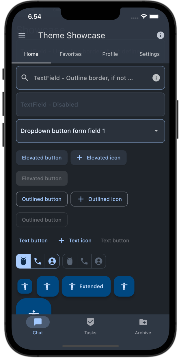 |
Created 24.10.2022, Updated 22.4.2023